


Tired of contemporary colour schemes and want to experiment with a mid-century modern look? From furniture choices to decorative room accents, there are many ways you can incorporate mid-century style into your interiors. However, one of the simplest ways to celebrate this enduringly popular interior design trend is to use an authentic mid-century colour scheme.
Mid-century modern design took shape in the 1940s. Initially, mid-century modern style was all about functionality, a trend also found in the architecture design of the period. While neutral palette combinations are synonymous with this post-war era, a typical mid-century modern interior was just as likely to feature bold colours, with many striking contrasts used for dramatic effect.
Rather than being defined by a subdued style, this was an era that embraced optimism. Bright colours abounded, providing the perfect balance to the natural materials and neutral colour palette favourites that were a staple of 1940 interiors.
Colours Commonly Found in Mid-Century Modern Colour Schemes
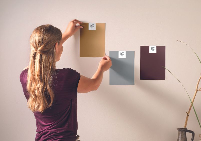
Thinking about creating an authentic mid-century modern space? You’ll need a palette packed with the right colours. If you need some inspiration to get you started, why not try some of these classic shades to create a colour scheme you can be proud of?
Deep Greys
Victorian Pewter
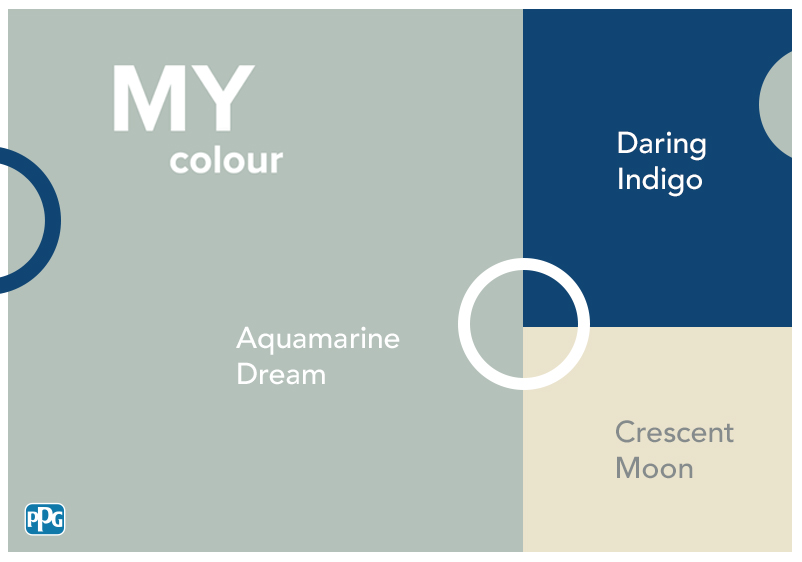
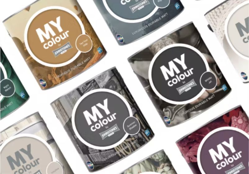
Sophisticated grey concord purple
Gathering Storm
Gathering Storm is a dark, cool, chalkboard grey with a black undertone.
Are you a fan of more understated interiors? Cool-toned primary colours serve as a great anchor for mid-century modern interiors, bringing you an easygoing backdrop that’s not too far removed from contemporary colour schemes.
Is it a more striking style you’re looking for? Go with a darker grey like Gathering Storm. This chalkboard grey is cool and definitely on the darker side, with black undertones giving it a backbone that makes a stunning first impression. Offset those darker hues with mid-century modern furniture made from lighter woods, or brighten things up with vintage accessories in bold colours like orange or mustard.
Would you prefer something lighter? Try Victorian Pewter. Despite the name, this paint colour is the perfect addition to a mid-century modern palette. A more sophisticated take on grey, this elegant hue is enriched with concord purple undertones.
Delicate Browns
Caramel Cookie
Soft and sweet clay beige with khaki
Rapid Rock
Greyish earthy beige with dusty pink tint
Understated browns have remained a mainstay of interior design, but are particularly synonymous with mid-century modern decor. The perfect partner to warm neutrals and natural materials, they’re ideal for creating an inviting ambience that’s ideal for living rooms and dining spaces.
Does your favourite space feel dank and uninviting? An earthy beige like Rapid Rock might be just what the doctor ordered. Infused with notes of grey, it pairs well with other mid-century modern design elements, while a dusty pink undertone brings warmth.
Alternatively, try a hue like Caramel Cookie. This clay beige shade is easy on the eye and soft enough that it can be woven into a multitude of colour palettes, even if you’re using bolder shades for accent walls and other features. A khaki undertone adds even more earthy character, making it a sound choice if you’re looking to create a truly relaxed spade.
If you want to liven up a mid-century modern interior, nothing beats a hint of bold red. An easy way to add warmth to sterile spaces, intense reds pair well with everything from warm neutrals to cool greys alike.
To add romance and create drama in a room, think about using something like Lipstick Rouge. This rocky red might be fairly subdued, but it packs spiced undertones meaning it packs a real punch. Even just a hint of this will overhaul an interior, making it ideal as an accent wall if you’re looking to add some intensity to your room palette.
If you’re looking for something more restrained, Clay Ridge is another option. This rusty red has real depth, while its shaded qualities make it a versatile addition to an interior. Use it in moderation against a warm off-white or neutral, or use it as an all-wall shade for a romantic dining area or tall-ceilinged living room.
Energising Yellows
Fuzzy Navel
Juicy pure sun-kissed dandelion yellow
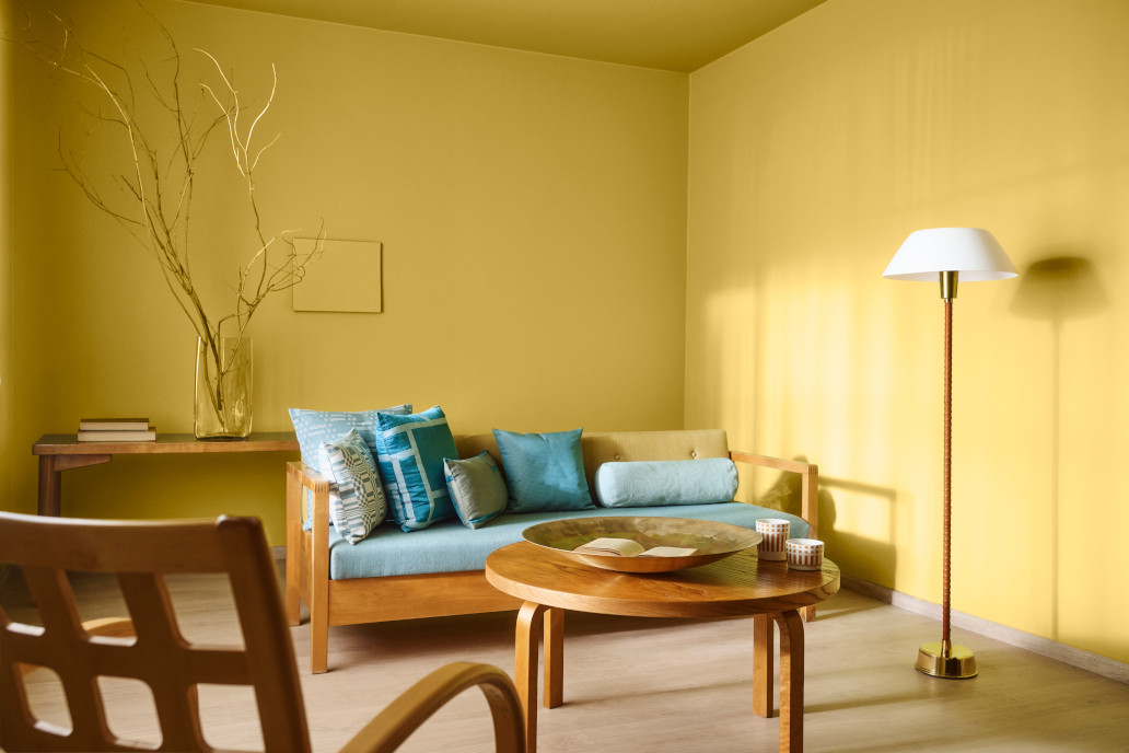
Primrose Meadow
Hearty pure zesty mustard yellow
An uplifting yellow can work wonders in a space that needs sprucing up. What’s more, these sunny shades make an authentic addition to any mid-century modern interior. Whether you want to use it as an accent or be more liberal with it, yellow serves as a beautiful backdrop for mid-century modern hallmarks like modular furniture, geometric shapes, and dark woods.
Don’t want to hold back with your choice of yellow? Why not give Fuzzy Navel a try? This sun-kissed dandelion hue will bring an uplifting energy to any interior, especially those spaces you use more in the morning.
For those more refined spaces, think about using a shade like Primrose Meadow. This zesty mustard paint colour makes an instant first impression. Make a statement by using this as an accent wall colour, or pair it with neutrals with earthy undertones for a more restrained room palette.
Eye-Catching Oranges
Malibu Sunset
Precious pure rusty orange
Sesame Crunch
Bright tangerine orange with a hint of sesame
A zesty citrus shade can help a mid-century modern room take shape. Oranges are a particularly good choice, bringing essential energy to an interior while allowing for big-impact transformations of tired-looking spaces.
For a more subdued space, think about using a paint colour like Malibu Sunset. This rusty orange paint colour will lend itself well to rooms furnished with dark woods like walnut or teak, while it makes an effortless pair with a wide variety of other colours. Keep your colour scheme simple by pairing it with classic white, or go for a more refined scheme enriched with earthy tones.
If a more dramatic makeover is on the cards, you could always try a paint colour like Sesame Crunch. This intense tangerine shade will invigorate interiors in desperate need of a new lease of life, while its sesame undertones can be paired with off-whites for a fuss-free colour scheme.
Vibrant Greens
Ignition
Glowing emerald green with jungle dashes
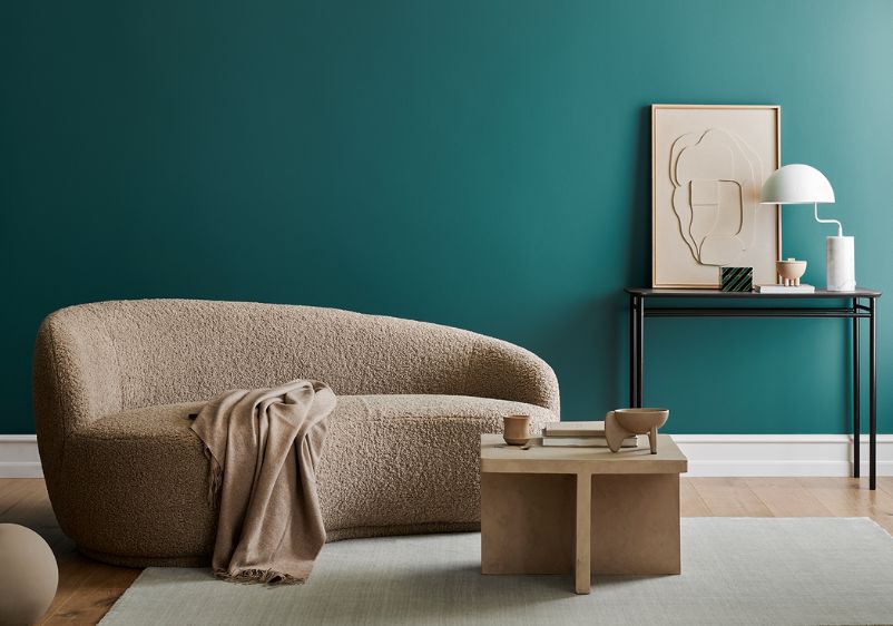
Key Largo
Wavy peacock green with a hint of seafoam
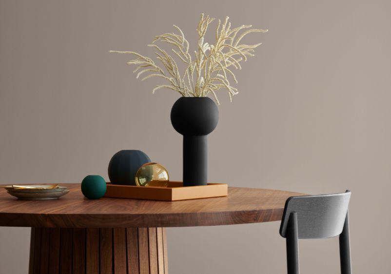
Vibrant greens are a stunning choice if you’re leaning more toward luxury with a mid-century modern makeover. Perfect for creating a dramatic backdrop for living spaces or enhancing dining rooms with statement-making accent walls, you can be as generous as you like when decorating with greens.
If you’re looking for an elegant addition to your room palette, consider giving Key Largo a try. This peacock green shade is a bold choice for creating a backdrop for your favourite spaces, although it can also be used in moderation alongside yellow-infused off-whites.
For a more sophisticated style makeover, there’s always Ignition. This emerald green has a glowing character, meaning even just a hint of this will bring a new dimension to your spaces. Jungle green dashes grant it added depth, which also pairs well with dark wood and dark earthy accents.