403 Forbidden
ERR_WEB_NGX_403

Tired of starting at wallpapered living room walls? Perhaps you’ve had enough of an all-neutral palette. If your living space is looking passed its best, you can liven things up with a palette dominated by lighter colours.
Just about every interior designer starts the creative process by thinking about light paint colours for living room interiors. These neutral shades are very effective at reflecting natural light, while they also serve as a versatile base for all decorating styles.
Not sure whether to stick with your existing furniture or start from scratch with brand-new pieces and fresh finds? A light-coloured palette means you’ll have a blank canvas that can be gradually adapted and embrace anything you can throw at it.
When you’re running short on living room paint ideas, light paint colours are the perfect fall back. Pure whites will open up any space, while warm-toned neutral colours will provide you with the welcoming atmosphere your living room is currently lacking.
Looking for lighter living room paint colours to revive your favourite spaces? Whether you're searching for the perfect colour combination or need the perfect shade to form the foundation of new colour schemes, you’ve come to the right place.

If you don’t feel like getting too creative in the living room, go with a tried and tested paint colour like White. Our purest white paint colour is a superb choice if you’re eager to bring your interiors back to basics.
With a coat or two of this, you’ll be able to create an ideal blank canvas so you can make your living space your own. If you want your furniture, upholstery and decorative objects to do all the work, there’s no better choice of background colour for your living room.

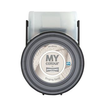
Keen to create a contemporary space that the entire family can enjoy? A pale taupe like Singing Sand will transform any living room into a modern-day masterpiece. A good alternative to classic beige, this versatile shade is a warm choice thanks to a subtle note of pink.
As it’s such a reserved shade, you don’t need to hold back when decorating with this paint colour. Combine it with other muted neutrals for a sophisticated interior that will work with all decorating styles and furniture choices. If you want to add more warmth to your walls, use pastel pink as an accent colour.

Don’t like the idea of using a pure white paint colour to freshen up your living space? Swansong is an irresistible alternative. This snow-white shade isn’t as overwhelming as its purer counterparts, although it will still leave your living room feeling crisp and fresh.
There’s also a hint of grey and blue here that will add complexity to your colour scheme. Use either of those colour families to accent architectural details, especially if you’re a fan of more modern interior design trends.

Have you been searching long and hard for neutral tones to transform those living room walls? A subtle sea glass green like Snowy Hill will bring a new dimension to your interiors.
You can use the green undertones as a primer for picking out other hues to accent your space. Just about every shade of green paint will work well alongside it, although you can always use bold colours like aquamarine and turquoise.

Seafoam greens are another surefire way to overhaul a living room. Delicate Mist is a majestic choice, with this aqua-green hue inspired by the ocean.
It’s a soft and gentle choice, making it ideal for larger living rooms that need reviving with a laid-back colour scheme. Working well with all manner of decorating styles, it will serve as a sophisticated backdrop for more contemporary setups. However, it will also lend itself beautifully to a more traditional living space.


Are you looking for a stunning alternative to off-white for a small living room? It’s worth giving Harbor Light a second look. A pared-back alternative to rich blue, this subdued periwinkle is perfect for creating a welcoming and calming space.
Those light blue walls will be a breath of fresh air, and you can even introduce different shades of blue for a tonal scheme. If you don’t feel like using blue as an accent, cool-toned neutrals and humble grey are also worth trying.

Do you usually go with blue when decorating your favourite rooms? Elevenses is an elegant choice for a living room, with this pale and pure crystal blue bound to brighten up your interiors.
This enchanting hue instantly creates a sense of serenity. You can use it as an all-wall living room colour, turning to cool neutrals or pure white to apply the finishing touch to room trims. For a more complex yet grounded colour scheme, experiment with shades like periwinkle or glacial grey.

Are you planning on decorating a living room with a north-facing aspect? Warmer tones work well here, ensuring your interiors never feel cold and uninviting during the day. A sun-kissed yellow like Silk Sails is a good choice if you’re looking for something a little more low-key, although a hint of lemon makes it a lively addition to any colour scheme.
This sultry yellow is a perfect alternative to sunnier shades, providing you with a measured amount of warmth that won’t overwhelm a smaller lounge or reception room. For a more mature palette, you can bring in earthy paint colours like mustard or muted brown.

Ready to revive your living room with a hint of yellow? Joyful is as uplifting as its name suggests. This zesty paint colour has bags of citrus character, while a hint of mustard brings some earthy balance.
Perfect for a north-facing living room, this eye-catching paint colour can be used to paint every surface. However, you can also make your space feel more grounded by accenting those mustard undertones with earthy complementary colours and spiced hues.

If yellow is too intense for your taste, go with a muted orange instead. La Minuet is a stunning design choice that will bring intensity and warmth to your spaces. What’s more, it fits well alongside neutral colours, with this paint shade boasting hints of copper and blush.
You can try simple colour pairings like pure white for a fuss-free palette. Alternatively, embrace visual interest with daring darker colours. Burnt orange is one option, while metallics are also effective and will accentuate those copper undertones.

A neutral living room doesn’t have to be boring and devoid of colour. With a shade such as Jasmine Flower, you can bring warming energy to your interiors, with this peachy hue making an instant impression thanks to its copper and orange undertones.
This impressive shade can be used to paint an entire room. With the right design accents, it can serve as the basis for a more modern space. Warm neutrals like greige work well alongside it to create a captivating colour scheme. If you want to create a more daring interior, use dusky shades or jewel tones for a living room feature wall.
