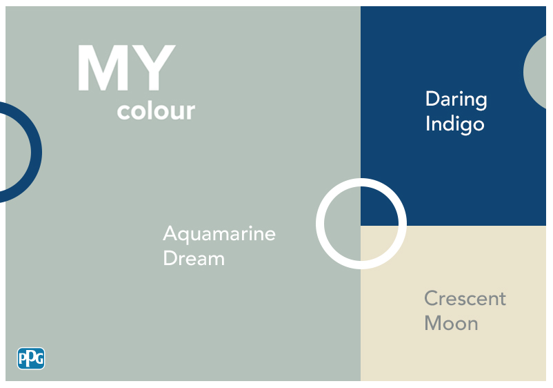


If you’re struggling to come up with hallway colour ideas, a neutral colour palette could be the answer. The perfect alternative to crisp white paint, neutral colours will instantly refresh your hallway walls and bounce light around effectively.
Because of how well neutrals maximise natural light, they’re ideal for a small space. Narrow hallways benefit particularly well from a neutral colour palette, although a larger transitional space will also suit a neutral-centric scheme.
Neutrals are also very versatile and you don’t have to be an interior designer to find beautiful colour combinations. Take your pick of any hue from the colour wheel and the results will impress. While lighter tones are good for smaller hallways, darker shades can also be used in moderation.
Use vibrant red or uplifting orange for a striking contrast, or go for something more soothing with hints of dusky pink or sage green. Effortlessly elegant, a grey entrance hall will endure the test of time and coordinate beautifully with the rest of your home.
Vanilla Float
Vanilla Float
Vanilla Float

Neutrals are a sensible choice for any hallway interior. However, you need to ensure that you’re using a shade that will leave your space feeling inviting to guests. An off-white like Vanilla Float is a good alternative to tepid neutrals, with this shade boasting dashes of red that bring plenty of warmth.
Ideal for a narrow hallway, this pale shade will open up a space with limited dimensions. What’s more, this hue will bounce light around with ease. It also takes on a new dimension when exposed to the warm glow of artificial lighting. If you want to introduce more colour, create a feature wall with a daring pop of red.
Scotch Mist
Scotch Mist
Scotch Mist

Just because you’ve decided on a neutral colour scheme, there’s no reason why your hallway can’t be an elegant one. For a more luxurious welcome, think about using a shade like Scotch Mist to decorate your hallway. This misty caramel white is enriched with a bronze tint, which brings understated sophistication to any interior.
You can stick to this as your primary colour or bring in other neutrals for a more varied colour scheme. Anything with brown undertones will work nicely alongside this neutral, although you can compensate for a lack of any accent colour by using metallic room accents and artwork.
Southern Breeze
Southern Breeze
Southern Breeze

Here’s another beautiful caramel white that’s perfect for bringing an air of sophistication to your hallway colour schemes. This effortlessly stylish neutral has an airy quality, making it an ideal alternative to the usual bright colour options. What’s more, its bronze qualities mean you bring in all manner of metallic accents.
Other neutrals will work nicely alongside this shade. Use lighter tones if your space is on the small side, or make a statement with dark earthy shades for gallery walls or architectural details. When it comes to accessories, think about using antique brass or bronze to accentuate those metallic undertones.
Casual Elegance
Casual Elegance
Casual Elegance

Taupe is a popular choice of neutral and works incredibly well in hallways. If you’re searching for the ideal shade, try Casual Elegance. With notes of both taupe and beige, this hue will bring a grounded quality to your interiors. What’s more, its pink undertones bring warmth to your space.
Choosing accent colours is surprisingly easy if you’re using this as your signature colour. You can use other light neutrals for a more subtle colour scheme, or turn to those pink undertones for inspiration. Don’t want to use other paint colours? Create a feature wall with patterned wallpaper instead.
Fairy Circle
Fairy Circle
Fairy Circle

The right neutrals can bring an uplifting energy to a dark hallway. If you’re searching for a sunshine-infused shade, think about using something like Fairy Circle. This pale grey is enriched with plenty of yellow, while hazel undertones bring balance. It’s subtle enough that you can use it on every wall, even if space is at a premium in your hallway.
Need some inspiration for creating a stunning colour scheme? You can do a lot with your hallway if this is your primary colour. Use other light neutrals to create a harmonious atmosphere, or turn to saturated yellows to make a statement.
Market Street
Market Street
Market Street

Many people turn to neutrals to keep things understated. However, neutrals can also make quite the statement. Take Market Street for example. This tarnished yellow is surprisingly evocative for something that falls into the neutral category, with its khaki undertones bringing plenty of depth.
Take your lead from either of these colour families when selecting accents for your hallway scheme. A splash of sunshine yellow will capitalise on the uplifting energy of this shade, while earthy hues and botanical colours will accentuate those khaki undertones.
Rocky Road
Rocky Road
Rocky Road

Searching for an easygoing neutral for your hallway? A beachy greige like Rocky Road is a good choice. It’s subtle enough that you can use it in a small hallway, although it won’t look out of place in a larger space either.
One of the more soothing shades in our range, this neutral boasts khaki undertones that provide you with inspiration for selecting accent colours. Any earthy hue will work nicely alongside this neutral, although lush greens can also be used to create a more vibrant interior. In both cases, you can enrich your scheme by using wooden furniture and natural accents to create an inviting atmosphere.
Gotta Have It
Gotta Have It
Gotta Have It

Does your hallway currently feel dull and uninviting? Perhaps whitewashed walls have left your space feeling devoid of personality. It’s time to transform your hallway interior with a neutral colour palette. With Gotta Have It, you have a veiled beige that will refresh any space. What’s more, red undertones mean it’s not lacking warmth.
An ideal addition to your entrance hall, creating a captivating colour scheme is easy with this as your anchor. Use other neutrals for a tonal interior, or turn to earthy shades for a more soothing space. Can’t decide on an accent colour? There’s no reason why you can’t keep things simple with bright white.