


Choosing interior paint colours takes time. Other than the bedroom, your living space is where you’ll probably spend most of your time when at home. As such, an ill-conceived colour scheme dominated by disastrous shades is something you want to avoid.
Finding the ideal candidate from the colour wheel for your living room walls is challenging for many reasons. Firstly, there’s the fact the living room is generally a shared space. You’ll need to find something that works for everyone who uses the space. A degree of versatility is also a good idea, allowing you to adapt your room and its aesthetics over time.
Neutral palettes are perfect for the indecisive interior designer who wants to please everyone, while warm-toned shades offer a stylish alternative to tried and tested taupe and barely-there beige. Striking the right balance also doesn’t mean you have to count out more daring shades. With accent colours and feature walls, you can incorporate a surprising number of hues into your living room.
What To Think About When Choosing a Paint Colour for Your Living Room
Tired of using the same colour choices every time you refresh your living space? If you want to find the perfect paint colour this time, take a little time to study your living room, its features and your design preferences.
Natural Light
Natural Light
Natural Light

Lighting plays a major role in how colours are perceived. A premium paint shade might look impressive straight out of the tin, but it’s not going to look the same once applied to your walls. An illuminating blue is going to look massively different during the daytime than the early evening, while a rich red will take on a new dimension once the afternoon gives way to the evening and indoor lighting is switched on.
When will you be using your living room the most during the day? If you work from home or have a flexible schedule, you spend several hours a day in your living room. Therefore, you’ll want a wall colour that maintains vibrancy during the daylight hours. If you only really use your space in the evening, you’re going to have to depend on artificial light, especially during the autumn and winter months. Different lighting sources affect colour temperature in various ways, so play around with bulb types as well as paint samples as you search for your dream shade.
Size of Your Room
Size of Your Room
Size of Your Room

How much space do you have available in the living room? The overall size and layout of your living room can play a major role in the colours you end up selecting.
Light colours are typically used in small or dark rooms, giving the illusion of space. Glossy hues and bright tones are particularly effective at this, allowing light to bounce around freely. Certain blues and greens with connotations of cloudless skies and grand open spaces can also trick the mind into thinking a room is far bigger than it is. If you don’t have a lot of square footage available, lighter hues or bright neutrals are a sensible choice.
Sometimes, colour is used to make a large space feel smaller. Older properties with high ceilings and generous dimensions aren’t always the most welcoming. If you want to downplay a lofty layout, you can use darker paint colours on walls and warm-toned neutrals instead of pure white on ceilings, mouldings and interior doors.
Existing Decor
Existing Decor
Existing Decor

If you want to choose paint colours that work for your space, look at your current decor and think about what items you’ll be holding on to. If your current sofa isn’t going anywhere, you’ll want a wall shade that complements this important piece of living room furniture.
Do you love mid-century design or the warm appeal of Scandinavian design? Use these design trends to guide your colour selection. Everything down to the flooring can give you some pointers about the kind of hues that are going to suit your space.
The Direction your Living Room is Facing
Now think about room orientation. North-facing rooms receive less light than other orientations, so use warm colours like pink, yellow and orange. Do you have a south-facing aspect? These spaces receive lots of sunlight, so think about balancing it out with cooler tones.
East-facing rooms face more varied light exposure, so colours can change during the day. If you’re using neutrals, you'll need to consider your undertones very carefully as these can look wildly different at various points of the day.
West-facing rooms have to wait until the late afternoon before they start receiving much sunlight. The sunlight that hits these rooms tends to be warmer, so you can use cool-toned shades like grey and blue for balance. If you want to use dark colours, expect natural light to have more of an impact on your decor.
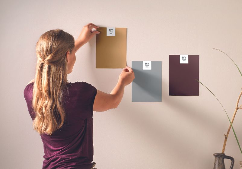
The Importance of Sample Pots
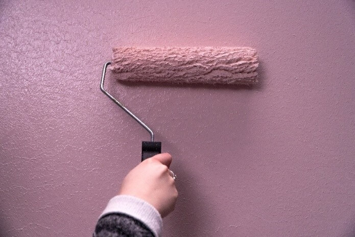
Have you ever returned home from your nearest paint store thinking you’ve got a dream shade for your living room, only to find the colour looks a lot different from one day to the next? You wouldn't be the first person this has happened to.
Using sample pots to see how paint looks on your wall at various stages of the day is the only way you’re going to get a true feel of a hue. What’s more, you can make better decisions about colour matching and selecting accents with the help of sample pots.
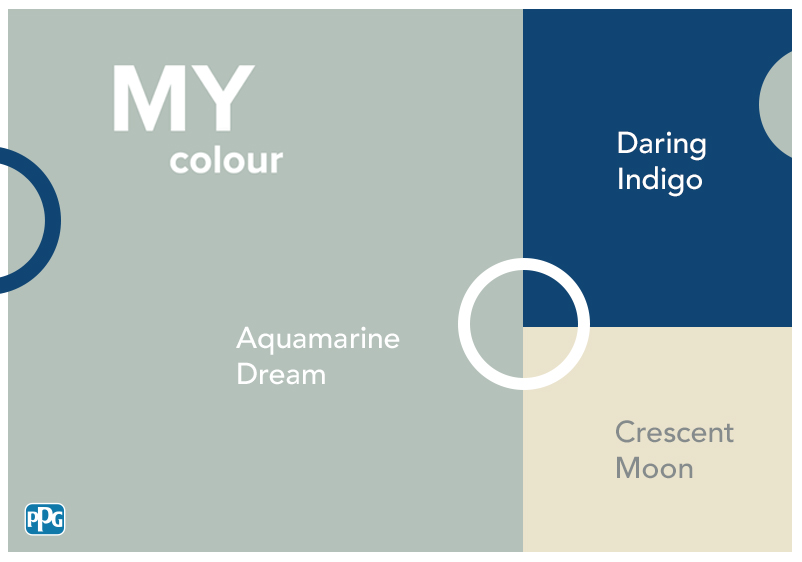
A Few of Our Favourite Shades
Ready to get going? At Johnstone’s, we’re confident you’ll find the perfect colour for your living room redesign. Below are just a few of our favourite shades for updating living room spaces.
Fine Fabric
Fine Fabric
Fine Fabric

Neutrals are a versatile choice. Fine Fabric is an uplifting option, with this yellow beige boasting a gorgeous green tint. It’s easygoing and is bound to enhance a contemporary home, especially when paired with minimalist design accents.
However, don’t be afraid to use it in a living room with more traditional design touches. Those green and yellow notes bring an uplifting energy to older rooms and can enhance the features in subtle architectural details. If you like the idea of adding multiple accent shades to your room palette, use the green and yellow undertones as inspiration. You can keep to a simple approach, with subtle yellows and light greens, or go for a statement with richer hues.
Cosmic Rays
Cosmic Rays
Cosmic Rays
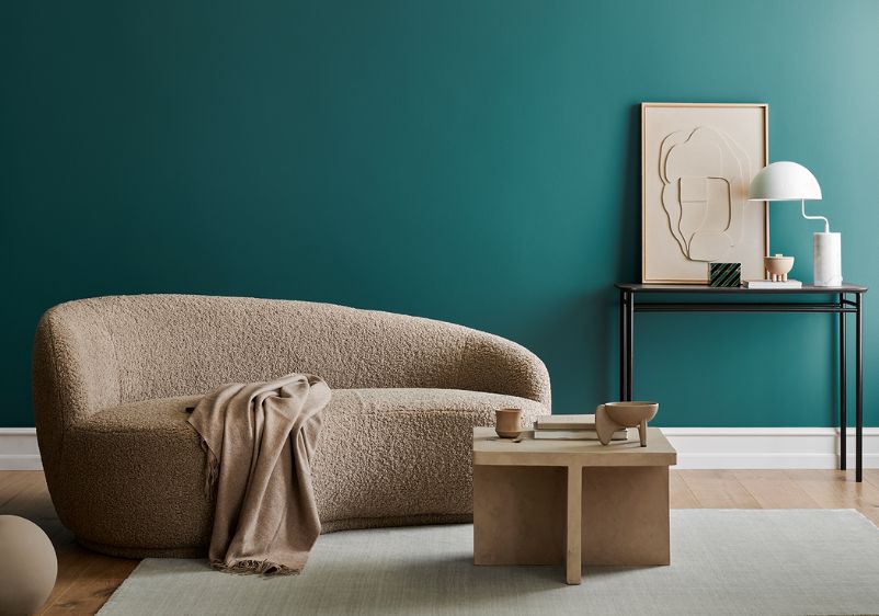
If your living room has a south-facing aspect, you’re good to go as far as cool tones are concerned. Cosmic Rays is an elegant option for anyone keen to play around with contemporary cool hues. This airy aqua makes a welcome addition to a modern home, bringing the calming qualities of blue to your living space.
A hint of cool grey makes this a stylish option for modern decors, while its understated quality means you can work it in alongside other colour schemes, even if you’ve gone in a wildly different direction in adjacent rooms. All the usual accents for blue can be used here. Pure white is a safe choice, but you can also use all manner of neutrals and cool-toned off-whites.
Prairie Fire
Prairie Fire
Prairie Fire

Browns can be a beautiful addition to living rooms. Earthy and embracing, they let you create a relaxing space where you and your loved ones can unwind. Prairie Fire is a superb choice if you want a strong foundation for a new living room colour scheme. It’s rich and inviting, but it is subtle enough that you can add layer after layer of colour relatively easily.
Mustard yellows and khaki tones work nicely alongside this beige, but you can keep things to the bare minimum with a classic pairing of off-white and beige. If you want a more luxurious finish in your living space, jewel tones can also be used to accentuate this beige. What’s more, a dusty palette of refined pinks can bring some contemporary appeal.
Yucca
Yucca
Yucca

With this aqua-green with a hint of blue, you can transform your living room into an interior design wonder. Moody and majestic, Yucca is perfect for making a statement in a living room that’s long needed some design attention. A vibrant shade, it can work well on its own, engulfing a room with pigment in all the right ways. If you’re decorating a small or dark room, moderation might be needed. Use an aqua or green-infused neutral first, then use this shade to create a focal point with a feature wall.
For a premium finish, invest in luxe accents and metallics to add some sparkle to your living room design. Alternatively, strip things back to the bare essentials, with comfortable seating, functional furniture, and rustic room accents.
Silent Delight
Silent Delight
Silent Delight

A contemporary classic, Silent Delight is an elegant shade that will elevate your space. However, unlike many other icy shades, this shade is warmer than you might think. You can enrich your room decor with more vibrant notes of colour. Intense purples can provide much-needed pops of character, while tonal greys can be used to make an impression with modern wall motifs.
You can even embrace an eclectic palette populated with a host of different colours. Provided you’re sticking with soft, shaded, or smoky tones, you can bring together everything from cloudy grey and aqua-blue to contemporary green and indigo black.