


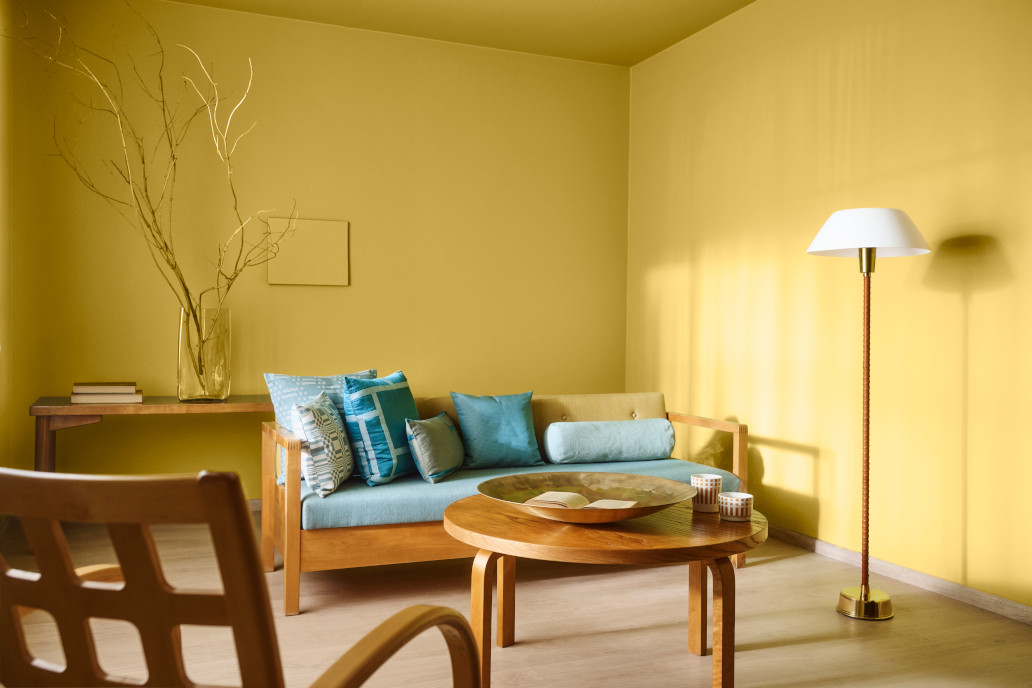
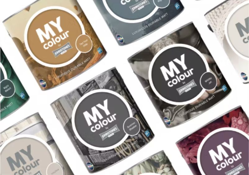

If your current kitchen decoder could do with an uplift, yellow is the perfect shade. With its inherent brightness and warmth, even a dab of yellow can be a ray of sunshine. Increasingly popular in interior design, yellow is surprisingly agreeable and works with a wide variety of other colours and decorating styles.
Are you a traditionalist with a penchant for tried and tested decor schemes? Pastel yellow paint will help you create a calming kitchen space that always feels like it’s basking in sunlight. Were you thinking about a more daring update for your kitchen? Why not create contrast with an intense yellow and charcoal pairing?
Dining rooms can also provide you with decor inspiration to create a harmonious home. If you’ve used a warm neutral with red undertones in your dining space, go with a red-infused yellow when decorating your kitchen. Take a look at our online range today to get started.
Vanilla Cheesecake
Vanilla Cheesecake
Smooth golden vanilla yellow
Vanilla Cheesecake
Smooth golden vanilla yellow

Let’s start by taking a look at one of our favourite yellow paint colours. Smooth like sweet vanilla and boasting a light gold tint, Vanilla Cheesecake is bound to brighten up any room. Although subtle, this muted yellow shade pairs well with other sun-soaked hues and provides a beautiful balancing act with neutrals or whites.
A splash of this will always be welcome in a traditional kitchen, while it will also suit a more contemporary cooking space. Not sure if your walls are ready for too bold a colour? This understated yellow is a versatile compromise.
Barely Butter
Barely Butter
Buttery soft sun-soaked dandelion yellow
Barely Butter
Buttery soft sun-soaked dandelion yellow

If you’re looking for an understated yellow to add to your colour palette, this sun-soaked dandelion yellow is something you should spend some time considering. Buttery soft and bursting with energy, this uplifting yellow instantly evokes feelings of springtime.
You can use it as part of an all-yellow kitchen colour scheme. Alternatively, ditch the strong yellows and pair it up with something simple like classic white. Cream can also work nicely alongside this colour, while those feeling more creative may want to play around with greys, greens and earthy tones.
Fresh Wheat
Fresh Wheat
Sweet light sun-kissed yellow
Fresh Wheat
Sweet light sun-kissed yellow

If you want to use yellow paint colours to bring warmth to your kitchen, a sun-kissed hue like Fresh Wheat is a wise addition to your palette. Sweet and light, it’s fairly understated but brings a refreshing energy to any cooking space.
As it’s a low-impact primary colour, you can use it to anchor subtle contemporary schemes. What’s more, it goes well with just about anything. It also works in classic country kitchens, with those uplifting undertones enhancing the appeal of wood and natural materials.
Biscuit Tin
Biscuit Tin
Pale sun-soaked soft honeyed beige
Biscuit Tin
Pale sun-soaked soft honeyed beige

In need of some more yellow inspiration? Biscuit Tin is one of the warmest yellow shades in our range, with this sun-drenched paint colour combining elements of soft honey and classic beige. A very subtle hint of grapefruit pink means you'll add another zesty element to your colour palette.
Perfect for a south-facing kitchen and dining room, you’ll be able to bask in the sunshine when enjoying your morning routine. Pair with other sunny shades for a mood-boosting interior, or coordinate with demure grey shades for a more contemporary finish.
Gentle Glow
Gentle Glow
Light yet bright sunflower yellow
Gentle Glow
Light yet bright sunflower yellow

Would you rather keep things subtle? A lighter yellow like Gentle Glow might be worth giving a try. Although light, this paint colour is on the bright side, taking its pigment inspirations from the petals of the sunflower itself.
If you’re using this yellow to decorate a kitchen, you too should look to the botanical world for colour inspiration. Think blooming meadows and the burst of springtime. The innate brightness of this hue means you can get away with using just a small amount of it to great effect. In fact, it’s perfect for picking out details in whitewashed spaces and versatile enough that you can use it as a primary colour.
Maybe Maui
Maybe Maui
Bright Hawaiian midtone yellow
Maybe Maui
Bright Hawaiian midtone yellow

Take a look at this yellow hue and let the tropical energy wash over you. Maybe Maui is a bright and cheery Hawaiian midtone yellow that’s full of juicy character. It instantly whips up images of white sandy beaches and azure waters.
You use occasional pops of this colour in a grey or monochrome kitchen for a contemporary design statement. Alternatively, make it your primary wall colour. Grey, black and white cabinetry should all work nicely with this hue. If you want to balance out all that bright yellow paint, make sure you’re being smart with your choice of room accents and decorative pieces.
Pineapple Salsa
Pineapple Salsa
Soft fruity firefly yellow-green
Pineapple Salsa
Soft fruity firefly yellow-green

Here’s another fruity favourite that pulls no punches. It might look a little soft at first glance, but this hue is a lively combination of yellow and green. Not sure which of these colours to use in your cooking space? Bring a touch of both to your kitchen with a splash of this paint.
It’s light enough that you can use it in the smallest of kitchens. However, it can also accompany darker tones in a bigger space for a more dramatic finish. Most types of material and cabinet colours should pair well with this hue. If you need to achieve a better balance, simply use green and yellow accents to your advantage.
Demeter
Demeter
Midtone citrus yellow with mustard tint
Demeter
Midtone citrus yellow with mustard tint

Now let’s explore some more refined takes on yellow paint. Demeter is a yellow hue for grown-ups, with this midtone citrus shade boasting a marvellous mustard tint. If you prefer earthy tones and retro-inspired palettes, you’re going to love anchoring a kitchen colour scheme around this one.
Understated and timeless, it’s perfect for cooking spaces where you want to be taken seriously. Enhance it with other citrus notes like orange and splashes of green, or keep it understated with grey and hazel tones.
Soft Buttercup
Soft Buttercup
Soft Buttercup is a mid, fresh, golden, butter yellow,
Soft Buttercup
Soft Buttercup is a mid, fresh, golden, butter yellow,

With a name like this one, you expect a lot in the way of yellow character from a paint colour. Soft Buttercup holds up its end of the bargain, granting you a fresh and golden butter yellow that will bring any kitchen to life.
This shade is a good choice for south-facing rooms that are flooded with sunshine during the day. It instantly revives a tired cooking space, even if you’re only using a small amount of it. Coordinate with more dramatic yellows for a tonal interior, or pair with classic companions like grey or an off-white hue.
Ochre Dreams
Ochre Dreams
Ochre Dreams is a dark, deep, golden, mustard yellow
Ochre Dreams
Ochre Dreams is a dark, deep, golden, mustard yellow

Have you made your mind up and decided it’s mustard yellow for your kitchen walls? A marvellous mustard shade like Ochre Dreams is going to make a good impression. You can use this classic colour on its own and let all that sunny goodness shine through.
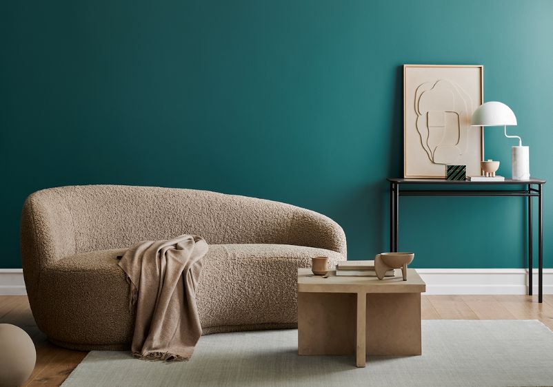
Alternatively, work it into a contemporary colour scheme dominated by stylish contrasts. This shade works wonderfully with monochrome flooring, while the likes of teal make for an effective counterpoint for mustard yellow walls.