


If you’re looking for drama and intensity from your next dining room redesign, a red palette is something you should probably consider. From claret-tinged neutrals to dark maroon, red shades make a stylish design choice in any dining space.
Something about red walls screams elegance. Even eclectic interiors that bring together all manner of fiery hues and colour contrasts are head and shoulders above safe neutrals and casual greys.
Red brings a lot of essential qualities to a dining room. It’s a bold and energising colour group, synonymous with passion and romance. Even a light red paint colour can evoke these feelings. In dining rooms, brick red hues help create a sense of intimacy and togetherness, with both being welcome in a communal room that’s primarily used for entertaining.
Whether you’re thinking about a traditional brick red to add warmth to your dining area or a more subtle shade to add colour to crown moulding, this fiery colour family is a fabulous choice for dining room interiors.
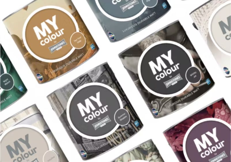
Tester Pots
- Featuring trend-led colours
- Try on different walls
- Made with 100% real paint
- Intense Colour Technology
- Luxurious durable matt finish
- Featuring trend-led colours
- Easy to apply
- Intense colour technology

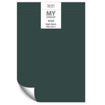
Spanish Garden
Spanish Garden
Saturated shaded spiced red
Spanish Garden
Saturated shaded spiced red

Are you looking to create a sense of intimacy with spiced wall colours and red accents? Spanish Garden could be the paint colour for you. This spiced red is rich and saturated, bringing all the colour intensity you need to reimagine your dining space. Use it to paint every wall and you’ll have an inviting space that’s perfect for staging dinner parties with friends.
With an irresistible combination of pink and red notes, this paint colour is bound to appeal if you’re a fan of dusky palettes. You can choose either colour family when adding accents to your space. For something more sophisticated, consider using autumnal tones to capitalise on the enchanting appeal of this saturated red.
Horizon Glow
Horizon Glow
Saturated subdued rusty red
Horizon Glow
Saturated subdued rusty red

Saturated but subdued, Horizon Glow is another great choice if you want to create a cocooning effect and set the right tone for intimate family mealtimes and dinner parties with friends.
It’s hard not to fall in love with this rusty red paint colour. Although it’s richer than many other shades of red, it’s not overwhelming. This makes it a suitable all-wall colour for even smaller dining spaces. If your dining room is particularly tiny, don’t discount this stylish hue entirely. You can still use it for a feature wall to bring bags of warmth to your space.
Clay Ridge
Clay Ridge
Deep shaded rusty red
Clay Ridge
Deep shaded rusty red

Rusty red is the perfect colour to add depth and up the drama in a dining room. If you’re keen to elevate the ambience of your dining space, use a paint colour like Clay Ridge. Deep and intense, it will elevate your interior design credentials and set the tone for intimate dinner parties and laid-back get-togethers with friends.
Although it’s a touch darker than some of our other reds, this rusty hue is versatile enough that you can use it on every wall of your dining room. Once you’ve taken care of that, consider your furniture. Upgrading to a hardwood dining table and chairs is well worth the investment.
Mesa Red
Mesa Red
Deep subdued rusty red
Mesa Red
Deep subdued rusty red

A more exotic red can make a welcome addition to a dining room, even if you’re limited to a fairly small space. Mesa Red is a deep and subdued rusty hue, with this dreamy shade perfect for setting the tone for your next dinner party.
It’s fairly intense, but that’s exactly why it works in creating an alluring atmosphere that will make your dining room a warm and welcoming space. It’s also versatile, working well alongside other red tones. Wine shades also make a perfect pairing.
Burgundy Wine
Burgundy Wine
Dark shaded rusty red
Burgundy Wine
Dark shaded rusty red

Dark red paint can prove very effective in large dining rooms. Burgundy Wine is a good design choice if you’re ready to explore darker takes on rusty red, with this premium paint colour delivering the drama.
As this is a relatively intense colour, you need to consider whether it’s the right choice for your space. If your dining area is too small to accommodate this as a signature colour, you can still put it to good use. Simply use it as a feature wall colour instead, then balance your decor with a warm neutral or softer shade of red.
Barn Door
Barn Door
Deep shaded Merlot red with an oaky tint
Barn Door
Deep shaded Merlot red with an oaky tint

If you’re keen to create a more mature dining space for evening enjoyment, look to deep reds when assembling your room palette. Barn Door is a shaded merlot with dusky tints, bringing plenty of warmth to your dining room.
You can use this paint colour alongside any spiced red, while the generous purple undertones mean you can incorporate wine-coloured accents if you wish. Eager to try something a little different? Think about using blush tones for a powder room-inspired palette.
What Type of Dining Rooms Will Benefit from a Drop of Red?
Some dining rooms are unlucky enough to have a north-facing aspect. Often considered the worst possible window aspect, north-facing rooms rarely receive any sunshine and next to no natural light. In the daytime, this leaves a room feeling dark and sterile. While you can always switch on a few lamps come the evening, there's a point in having a dining room you can only use for a few hours every day. To add some warmth to a north-facing dining room, use a palette rich in spiced wine tones, autumnal hues and fiery reds.
If you live in a particularly old property, you might have a dining room with high ceilings and ornate architectural details. Whether your home is Edwardian, Victorian, or even older, colour choices are particularly important. Rather than replace these historic room accents with modernised finishes and streamlined mouldings, use a coat of saturated scarlet or ruby red to give these ornate details a new lease of life.
Which Colours Pair Best with Red in a Dining Room?
Even the most dramatic shade of red pairs well with a surprising amount of colours. If red is the primary colour in your dining room, a high-contrast monochrome floor is a dazzling design choice. If you’ve used a deep red to paint your walls, think about using dark wood and rich navy to accent your space.
Have you selected a bright shade for your dining room? You can have more fun when it comes to selecting accents. Cyan is an incredibly popular pairing with vibrant red, while splashes of mustard brown and sunny yellow can also work well.
For a more contemporary dining room, use grey paint colours as an accent colour instead. Anything from concrete to charcoal should work alongside red walls. Even if you’ve used red in small doses, you can still think about its complementary colours when adding more hues to your room palette. On the colour wheel, the direct opposite of red is green. Whenever you bring these two colours together, you can expect good things. Wondering how to put this into practice if you’ve only used red to paint a feature wall? A single teal accent chair or a touch of turquoise upholstery will ensure an instant sensory connection between these two colour families.