


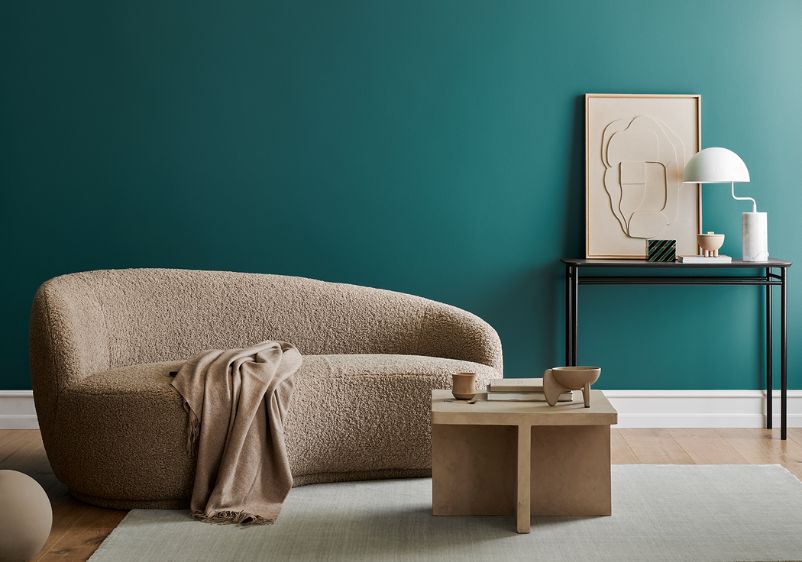


Colour plays a critical role in the dining room design, perhaps more so than any other space in the home. When you’re hosting dinner parties or gathering around the table with family for special occasions, you want the room around you to create a warm and inviting atmosphere. The easiest way to create the right ambience is by rethinking what colours you’re using on your dining room walls.
Because they’re not as heavily used as other rooms, dining spaces tend to get overlooked when decorating a home. However, a well-designed room enhanced by contrasting colours, accent walls or even a monochrome palette can easily become your favourite space in the house.
Are you hoping to transform your dining room into a more sociable space? Out to impress with a contemporary overhaul with a jaw-dropping focal point? Read on for some dining room paint ideas to help get you started on your design journey.
Peach Pudding
Peach Pudding
Peach Pudding

It’s easy to reach for an off-white when decorating a dining room space. However, you don’t have to settle for something boring just because you’re playing it safe with a neutral. Peach Pudding is a serious upgrade of the usual neutrals, with this sandy red making a great first impression thanks to its balmy qualities.
It’s a good choice if you’re usually drawn to shades like blush pink, but find those hues too playful. Here you have a subtle colour that can play anchor to a designer dining room palette. Pair with pink-infused beiges or timeless taupe for a dream dining room colour scheme.
Harvest Day
Harvest Day
Harvest Day

If you’re finding it hard to come up with a colour scheme for a small dining room, beige is always a great choice. With Harvest Day, you have a tarnished take on beige, with this pale hue working nicely in spaces that are a little on the small side.
This beautiful hue makes use of every last ray of natural light, helping a small room feel bigger. What’s more, khaki undertones provide you with a useful reference for introducing secondary colours. Add some leafy green to your dining room with upholstered dining chairs, or bring some sunny yellow to your scheme with some vibrant artwork.
Solitary State
Solitary State
Solitary State

Getting a colour scheme right in formal dining rooms is rarely easy. Between establishing the right ambience and ensuring your space is family-friendly, it can be quite a balancing act. With Solitary State, all the guesswork is taken out of the equation, with this soft stormy grey guaranteed to prove a hit.
This stunning paint colour shows that shades of grey don’t always have to be cool and uninviting. This warm take on grey is ideal for modern dining rooms, serving as a gorgeous backdrop to minimalist furniture and contemporary display pieces. If you want to bring in another colour or two, stick to darker shades like teal and mustard, or add a splash of burnt orange for vibrancy.
Nightcap
Nightcap
Nightcap

Dark and moody hues are perfect if you tend to use your dining room for dinner parties and entertaining. If you’re searching for something to set the tone for memorable evenings, Nightcap might be worth seeking out. Combining stormy blue with nocturnal grey, this stunning shade is sure to impress.
A more muted alternative to turquoise, this blue paint colour still exudes the same level of luxury. While it’s relatively dark, it’s not so intense that it will leave a small dining room feeling cramped. In fact, you can use it on every wall and still give yourself plenty of breathing room. Balance it out with lighter grey-blues or off-white. To elevate your decor, use metallics and rich woods.
Windsor Haze
Windsor Haze
Windsor Haze

Blue is another shade you’d usually associate with the cooler side of the colour spectrum. However, Windsor Haze breaks the mould with a periwinkle blue that’s infused with purple. Although it's a relatively light colour, it’s a surprisingly warm one, making it ideal for establishing an inviting ambience in your dining room.
With none of the downsides and all of the benefits of blue, you can use this shade to create a serene dining space that will let you escape from the world come dinnertime. Perfect in a more traditional space, this hue also works in a contemporary setting as a lovely alternative to off-white, taupe and other neutral shades.
Linen Drawer
Linen Drawer
Linen Drawer

Are you thinking about bringing some sunshine yellow to your dining room? While a bright yellow might be out of the equation, you can still add an uplifting energy to your dining room with something like Linen Drawer. This tarnished yellow has a gorgeous creamy quality, while khaki tints bring depth.
If you want to go with citrus hues but don’t want to overload a small dining space, here’s the perfect alternative. The khaki tints balance things out nicely, giving you the option of working more green and earthy notes into your colour scheme.
Holly Glen
Holly Glen
Holly Glen

The right colour choice can turn an unused room into a truly magical dining space. Holly Glen is one such colour, with this greyish aqua-green making a rich and refined addition to your dining room walls.
It might be muted, but this eye-catching hue makes quite an impression. Work in a couple of shades of grey for a contemporary aesthetic or go wild with an assortment of botanical hues as a nod to the green qualities of your primary paint colour. You can also introduce some earthy tones to your space, either with paint colours or accessories. Living walls and wooden furniture are going to look right at home with this as their backdrop.
Prairie Moon
Prairie Moon
Prairie Moon

If you’re passionate about neutral colour schemes, you’ll absolutely love this icy purple paint colour. Prairie Moon is infused with mulberry tints, with an enchanting astral quality that makes it a singular addition to any dining space.
Soft and serene, it’s easy to coordinate this breathtaking colour with adjacent rooms. The undertones bring a touch of refinement, while they also provide you with a handy anchor if you want to add a feature wall or introduce room accessories. You can use dark furniture to create some subtle contrast but try to avoid dark shades as accent colours, opting for delicate greys and misty hues instead.
Field Puddle
Field Puddle
Field Puddle

Were you thinking about a nautical-themed design for your dining room? It’s a timeless look that works nicely in most homes, but pulling it off successfully can be difficult. To get started, you’ll need a classic blue hue for your walls. A sapphire blue like Field Puddle meets all the required criteria and more.
This blue shade is rich and full of character, but it never comes close to being overwhelming. You can use it in a smaller dining room without your space feeling like it’s being consumed by colour, while wall art and chair upholstery can be used to bring in more dramatic pops of colour. While all the usual colour complements can be used alongside this blue, nothing beats pairing it with a warm white.
Almond Brittle
Almond Brittle
Almond Brittle

Yellow paint colours are perfect for dining rooms, especially if you tend to use your space more during the morning. Soft and subdued, a shade like Almond Brittle will grant your dining area the kind of energy it needs to inspire a groggy you first thing in the morning.
This bronzed caramel yellow lets you bring the sunshine straight to your dining space, without you having to depend on citrus tones and neon hues. If you find it’s a tad too muted for your liking, simply bring some further splashes of colour. When in doubt, use golden tones as a glorious addition. If you want to add a feature wall, why not look at complementary colours for a dramatic pairing? Blue and purple are the go-to choices for contrasting with yellow and will work wonderfully alongside this one.