


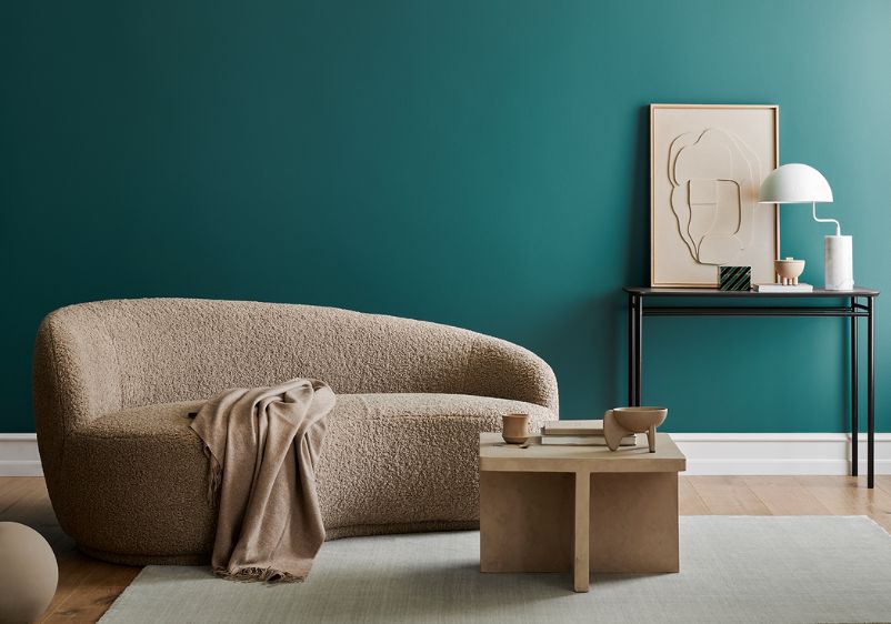


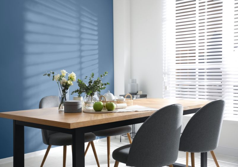

When putting together a dining room palette, warmer hues like tan and red tend to be the first shades we settle on. While these colours will help make a dining space feel warm and welcoming, they’re not the only option. Instead of taking the traditional route, think about tapping into the soothing qualities of the colour blue.
Blue paint colours are a welcome sight in the bedroom, with these tranquil shades helping restless minds switch off. From timeless navy and cobalt to pale sapphire and sky blue, this colour family is packed with premium hues that should be celebrated elsewhere in the home. Blue dining rooms are the perfect place to showcase these stylish shades in all their glory.
A muted blue palette can bring some calm to those hectic family mealtimes, while classic cornflower will serve as a neutral backdrop for entertaining. Whatever your style of decor you favour, blue tones make a terrific foundation for any dining space.
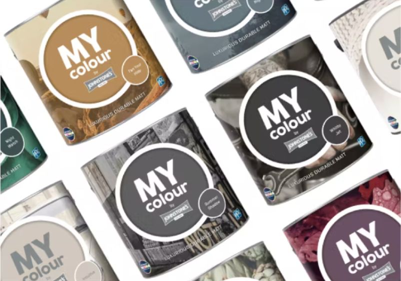
Tester Pots
- Featuring trend-led colours
- Try on different walls
- Made with 100% real paint
- Intense Colour Technology
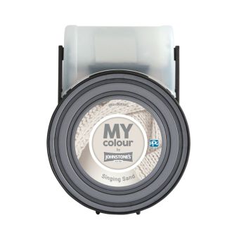
- Luxurious durable matt finish
- Featuring trend-led colours
- Easy to apply
- Intense colour technology

Windsor Haze
Windsor Haze
Hazy light periwinkle blue-purple
Windsor Haze
Hazy light periwinkle blue-purple

The best blue dining room ideas need a standout colour to anchor them. Windsor Haze is a gorgeous starting point for any dining room redesign. Combining notes of periwinkle with hints of purple, this delicate hue will help open up a smaller space.
It also brings the calm-inducing quality that blues are famous for. Ideal if everyone tends to descend on your dining room during the morning rush. A versatile palette starter, this blue works beautifully alongside most styles of furniture and can be effortlessly incorporated into all manner of colour schemes.
Duck's Egg Blue
Duck's Egg Blue
Light and bright sapphire blue
Duck's Egg Blue
Light and bright sapphire blue

If you’re after a more vibrant shade to start your dining room redesign, think about using Duck’s Egg Blue. Light and bright, this stylish sapphire shade will revive any dining room, however big or small.
You can use this enchanting blue on its own alongside pure white colours. Alternatively, play around with cool-toned greys and tonal blues for something a little more refined. Not sure you’re ready for an all-blue dining room? Think about using this serene shade to accentuate architectural details or for a feature wall.
Pistachio Cream
Pistachio Cream
Creamy light bluish airy aqua
Pistachio Cream
Creamy light bluish airy aqua

Does your dining room feel cramped and claustrophobic? A lighter blue could be the perfect remedy. Pistachio Cream is a bright and breezy aqua that will open up a space, while a powdery quality gives it a sophisticated finish that makes it a welcome addition to formal dining rooms.
Use this paint colour as a beautiful backdrop for ornate dining furniture and antique decorative pieces. Alternatively, make it part of a more modern space. It’s far from overwhelming, so sits nicely alongside more minimalist furniture and streamlined decor.
Fresh Sleet
Fresh Sleet
Light subdued twilight arctic blue
Fresh Sleet
Light subdued twilight arctic blue

Cool and mellow, Fresh Sleet is perfect for those looking to use a slightly darker shade of blue in the dining room. It might be a fairly icy-toned choice, but this enchanting blue brings essential elegance to any dining space.
Use it to freshen up drab spaces or add it to a broader palette dominated with blues for a tonal scheme. Whatever you decide, this blue is guaranteed to provide you with a beautiful backdrop for family mealtimes and entertaining.
Acapulco Cliffs
Acapulco Cliffs
Bright muted marine aqua-blue
Acapulco Cliffs
Bright muted marine aqua-blue

Do you need a blue for a contemporary makeover of a tired dining space? Acapulco Cliffs could be the ideal solution. This muted take on marine aqua blue is bound to brighten up any dining room, making it ideal for smaller layouts.
You can use it to make a statement in a modern interior, either as an all-wall colour or a high-impact feature wall. What’s more, this beautiful blue hue looks superb alongside all types of decor, from solid wood sideboards to a dining room table made from frosted glass.
Turning Skies
Turning Skies
Wonderful grey, Caribbean aqua with turquoise
Turning Skies
Wonderful grey, Caribbean aqua with turquoise

Are you keen to bring the serene energy of blue to your dining room, but still want to embrace a more contemporary aesthetic? Turning Skies brings you all the qualities you need. This intense paint colour is a moody mashup of grey and turquoise, making it ideal for creating a captivating dining space for entertaining.
This stunning blue works equally well in traditional and modern interiors. You can use it to bring period features to life in an older room or make it your backdrop in a contemporary dining space.
Clear Your Mind
Clear Your Mind
Pale neutral majestic blue-purple
Clear Your Mind
Pale neutral majestic blue-purple

If you prefer paler shades to saturated ones, Clear Your Mind could be the colour you’re looking for. This stylish neutral colour is a delicate balance of blue and purple, making it an understated but complex addition to any dining room.
You can use either colour as inspiration when accenting your space with further detail, whether that’s a second splash of colour on your walls or soft furnishings and decorative objects. To bring out the icier hues of this paint colour, think about investing in blue dining room chairs or cool-toned curtains.
Ocean Fog
Ocean Fog
Light and bright breezy bay blue
Ocean Fog
Light and bright breezy bay blue

Light blue rarely looks out of place in any interior. Bright and breezy, Ocean Fog is one of the more alluring light blues around, making it a strong candidate if you’re ready to transform your dining room into a space you dream of spending time in.
Refreshing and neutral, it can work well alongside any style of decor. Use it as a backdrop for traditional dining room furniture or introduce more dramatic pops of colour for an eclectic and contemporary aesthetic.
Dresden Dream
Dresden Dream
Dreamy neutral orchid blue with violet tints
Dresden Dream
Dreamy neutral orchid blue with violet tints

A more sophisticated shade of blue will beautify any dining room. Although Dresden Dream is technically a neutral hue, its orchid blue pigment and violent undertones make it an irresistible choice for dining room redesigns.
If you’re using this to paint your walls, go for dark woods when choosing new furniture for your space. Thinking about investing in new light fittings? Polished brass will add a touch of timeless luxury. If your tastes are more modern, this blue is still a brilliant idea. Use it alongside cool grey shades for a contemporary colour scheme and furnish your space with sleek furniture pieces made from steel and glass.
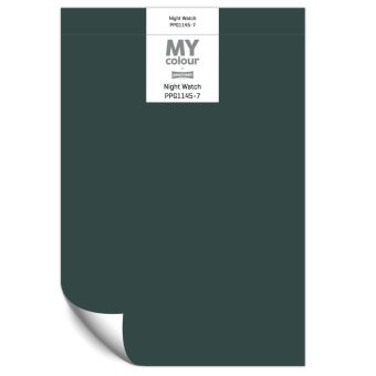
Forgotten Lake
Forgotten Lake
Deep shaded indigo blue with cobalt tints
Forgotten Lake
Deep shaded indigo blue with cobalt tints

Deep blue walls can make a dramatic addition to any dining room. A shaded indigo like Forgotten Lake is a good option if you’re planning on making a bold design statement, while its cobalt undertones make it especially hard to resist.
A terrific alternative to shades like turquoise, this beautiful blue will give your dining space the shot in the arm it needs. Use it on every wall as a mesmerising backdrop in contemporary interiors decked out with an eclectic mix of materials and furniture styles.
What Makes Blue a Good Colour for a Dining Room?
Blue shades are popular in the bedroom because they can induce a feeling of calm, helping restless minds shut down and drift off to sleep. If you tend to sit down and eat later in the day, a blue dining room palette can have a similar effect, helping you relax and ease into the evening.
However, blue tones prove their worth at any time of day. While it isn’t the most reflective of colours, blue walls take on a new dimension when exposed to natural light. In other words, your dining space will have a distinct character in the daytime, before taking on a more mellow one once the sun sets and you reach for the light switch.
You also have plenty of choice when it comes to blue paint colours. It’s one of the most extensive of all the colour groups, with shades ranging from ultra-subtle icy whites to intense indigos. It won’t take you long to find a blue that ticks all the right boxes, with many shades being remarkably versatile. If you can’t settle on a single blue paint colour for your dining room, you’ll probably find that you can use all of them together seamlessly. What’s more, blue looks beautiful when paired with a wide range of other colours. Cooler tones like grey tend to work best, but you can also deploy complementary shades of orange for a more dramatic dining space.