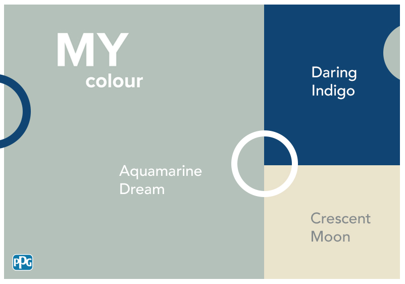


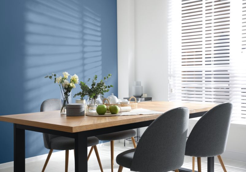

Navy blue is an interior design favourite. A popular choice for feature walls and an impressive alternative to traditional deep blue hues, you don’t have to use too much to transform a space.
However, deciding on the right complementary colours isn’t always easy. Whether you’re undertaking a navy living room redesign or want to add a navy wall to your bedroom colour scheme, choosing the right accent colours is crucial.
Wondering what colour goes with navy blue? You can combine navy blue with cool tones like grey and other blues. If you’re using a neutral navy, try adding hues like cornflower blue into the mix. If you’re only using navy sparingly, think about using a darker shade of blue.
However, there are many other options on the colour wheel to consider. A hint of pastel pink can bring beautiful balance to a space, while a shot of lime green or mustard yellow will revitalise a drab interior that’s crying out for an energy kick.

Off-White
Pacific Pearl and Dark Summit
When in doubt, keep things simple by pairing navy with a timeless neutral like off-white. Start with selecting a suitable navy for your walls. Dark Summit is an intense choice, with this stormy blue evoking the qualities of a moody night sky. Used in moderation, it’s an effective colour choice for living spaces or bedrooms.
Now you’ll need to find a lighter shade to balance things out. Turn your attention to the most subtle corner of the colour wheel for this. A pale white like Pacific Pearl is a good choice. Serene and sophisticated, it’s a clear-headed counterpoint to an intense navy. If your room still needs a pop of blue, think about adding breezy sheer curtain panels in your favourite navy shade.
Midnight Sapphire and Garlic Clove
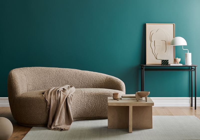
If you’re not afraid of intense colours, navy is the perfect shade. Midnight Sapphire will go down well with those who favour richer hues, with this brilliant blue boasting more than a hint of black. Perfect for feature walls, you can also use it as an all-wall colour if you want to make a space feel smaller and more intimate.
If you’re using this shade as a feature wall colour, you will need something softer to balance it. A pale off-white like Garlic Clove is an ideal choice. The neutral undertones make it an easy pairing with any colour, while hints of sage work well alongside blue tones like navy.

Neutral
Midnight Sapphire and Singing Sand
Neutrals are another tried and tested pairing for navy walls and are ideal if you’re keen to create a timeless colour palette. Get things started with a dark navy like Midnight Sapphire. It’s an intense hue with more than a hint of black but can prove very effective as a feature wall colour.
Using this colour successfully is a balancing act, but the right accent colour can help. A pale taupe like Singing Sand will work nicely, serving as an elegant alternative to muted tones like beige. Pink undertones bring a playful edge, while also adding warmth to your colour palette.
Dark Summit and Winter Caress
In the mood for a more dramatic design makeover? Go with a shaded navy like Dark Summit. With hints of green, it’s a complex colour choice that will transform the character of your bedroom or living space.
Next, you’ll need something understated to bring balance. If pure white isn’t to your liking, think about using something like Winter Caress. This subdued take on yellow beige brings all the benefits of any neutral but also infuses your room with some sunny character.

Blue
Midnight Sapphire and Clear Your Mind
Don’t think you can combine navy and blue? Think again. With the right icy tones, there’s no limit to how many hues from the blue colour family you can use. First off, pick your preferred navy. A dark shade like Midnight Sapphire is a good idea if you want to make a statement, with its black undertones leaving a lasting impression.
Now you’re ready to bring some balance with a lighter blue. A shade like Clear Your Mind is a good choice. Pale and understated, this majestic hue brings together the finest qualities of blue and purple. You can create added complexity by bringing a couple of grey tones into the mix.
Dark Summit and Tin Soldier
Navy blue is a bold design choice, but it’s very effective at transforming the energy of a room. A shade like Dark Summit is a superb choice if your current decor needs a shot in the arm, with this intense shade boasting subtle hints of green that broaden your horizons when selecting accent colours.
To avoid distracting from your navy of choice, stick to muted shades when selecting accents. A neutral Arctic blue like Tin Soldier is a good option. If you’ve only used navy for a feature wall, think of other ways to incorporate the colour elsewhere. Navy blue accents like soft furnishings and decorative pieces are ideal ways to introduce this colour to smaller spaces.

Yellow
Midnight Sapphire and Fuzzy Sheep
Yellow and blue are a timeless colour combination. If you want to realise this enduringly popular design trend in your own home, choosing the right shades is crucial. Midnight Sapphire is guaranteed to appeal. Deep and intense, this navy blue boasts more than a hint of black. It’s a great choice for a feature wall, but the more daring interior design lover may want to use this as an all-wall colour.
If you have decided to use this navy generously, don’t hold back with balancing accent colours. A tarnished yellow like Fuzzy Sheep is a good option, with its khaki tints working well alongside any shade of blue.
Dark Summit and Vanilla Love
In the mood for a more vibrant colour scheme? Dark Summit is the perfect colour choice to get the ball rolling. This shaded navy captures the energy of a stormy night sky, while undertones of green bring essential depth.
Because of those undertones, you’ll find that this navy works particularly well with any yellow hue. Vanilla Love will work particularly well, with this balanced shade enriched with a hint of hazel. It’s the perfect accompaniment to a room’s navy blue finishes. Not enough blue for your liking? Navy blue furniture and room accessories can be relied upon to satisfy those colour cravings.