


Think crisp white is your only option when decorating a smaller space? Think again. Cream paint colours are a stylish alternative to traditional white, amplifying natural light and making a space feel bigger.
Wondering what colour goes with cream? With cream walls, you have a versatile blank canvas. A cream backdrop can be accentuated with just about any hue, working well with warm tones and cooler hues alike.
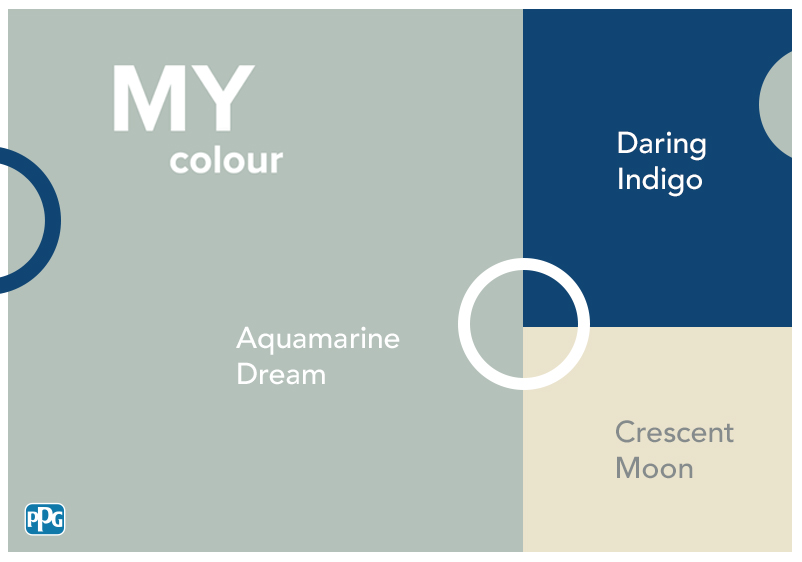
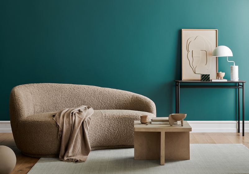
You can bring energy to your cream colour palette with shades like forest green and royal blue. For a more modern edge, why not pair green with emerald green or intense blue tones like teal?
If you struggle to relax, turn to this classic colour family. Cream creates a soothing atmosphere in any bedroom or living room. It’s also a good choice if you’re thinking about tonal decorating. Our cream wall paint comes in a wide variety of shades, making it easy to create a tonal interior you can be proud of.

Purple
Linen Drawer and Lilac Time
If you want to uplift a cream interior, purple is an ideal choice of accent colour. First, you’ll need the right shade of cream. Something like Linen Drawer will work nicely in any interior. This creamy hue is technically a tarnished yellow, bringing a sunny energy to any space. Khaki undertones bring added complexity.
You’re now ready to bring some purple into the mix. A mid-tone shade like Lilac Time will work nicely alongside a sunny cream. As the name suggests, there’s plenty of lilac pigment here, although it’s a darker take on this purple colour family.
Heavy Cream and Wine Frost
For a more simple aesthetic, think about pairing off-white with a subtle shade of purple. Start with a sepia-infused shade like Heavy Cream. Although this is light in character, this paint colour has umber undertones that bring a surprising amount of depth. It also provides you with the ideal base for introducing purple accent colours.
Use a subdued purple like Wine Frost to balance things out. It might be muted, but this mauve-infused shade makes an impression thanks to a hint of magenta. You can use both colours in equal measures as wall colours, or stick to using this one for a few key details. If your space still feels cramped and overwhelmed with colour, introduce some cream furniture. Decorating a bedroom? A cream bedspread and neutral textiles will help create a more soothing atmosphere.

Grey
Grey Whisper and Linen Drawer
Grey and cream might not seem like the most inspired pairing, but they’re a dream combination in a more contemporary home. A creamy tarnished yellow-like Linen Drawer is a perfect alternative to whitewashed walls, while those khaki undertones provide you with ample opportunity for introducing earthy accents.
When it comes to accent colours, go with a lavender-infused shade like Grey Whisper. This elegant grey has a slight touch of silver, meaning even a little will bring some understated luxury to any interior.
Snow Storm and Heavy Cream
Thinking of decorating a kitchen with cream colours? A sepia-infused off-white like Heavy Cream is the perfect colour choice. Ideal if you’ve been thinking about cream kitchen cabinets, this enchanting hue is enriched with an umber tint that brings bags of depth to any colour scheme.
Cool-toned accent colours work well in a kitchen. Navy blue and sky blue will work particularly well alongside cream cabinets, although just about any light blue can be used effectively. For maximum impact, however, go with a mauve-infused grey like Snow Storm.
Red
Heavy Cream and Spanish Garden
If a cream paint colour sounds too uninspired for your liking, you can add some fire to your interior design with a pop of red. To get started, select your preferred take on cream. An off-white like Heavy Cream is a good choice, with this sepia-infused shade also boasting umber undertones that work exceptionally well alongside red.
You can use a more daring red thanks to those undertones. A spiced shade like Spanish Garden will make a welcome addition to living rooms or dining spaces, with its saturated pigment making it a fabulous choice for a feature wall.
Linen Drawer and Chianti
If you prefer more subtle colour schemes, stick to reserved reds when decorating with cream. Firstly, you’ll need a versatile cream shade for your walls. Linen Drawer is a good option, with this tarnished yellow boasting khaki undertones that will work well alongside the intensity of red accents.
Instead of saturated shades, go with a rusty red like Chianti instead. It’s rich and refined, with an unmistakable hint of chocolate brown that goes beautifully with the khaki undertones of your chosen cream.

Green
Linen Drawer and Life Lesson
Green and cream might not seem like an obvious pairing, but they actually work surprisingly well together. While dark green should be avoided, neutral shades like Life Lesson can be a good choice. Soft and subdued, this minty green hue will refresh your interiors effortlessly.
You’ll need a classic cream hue to balance out your green of choice. A tarnished yellow like Linen Drawer is an ideal choice. Its yellow undertones work well alongside green, while its khaki undertones can be enriched with earthy accents. Does your cooking space need a makeover? Cream kitchen units are always in style, with this shade being the perfect candidate for giving your existing cabinets an entirely new look.
Heavy Cream and Cassiopeia
Off-whites and low-key greens are a timeless colour combination. However, if the likes of sage green and olive green aren’t to your liking, go with something like Cassiopeia instead. This seafoam shade is a perfect alternative to pale botanical shades, while it can be enriched by using a dark green accent.
However, it’s all about creating balance and playing to the strengths of your space. If dimensions are limited, use a subtle hue like Heavy Cream as your primary colour. In a smaller living room, you can still incorporate your favourite colour with a green velvet sofa or soft furnishings.