


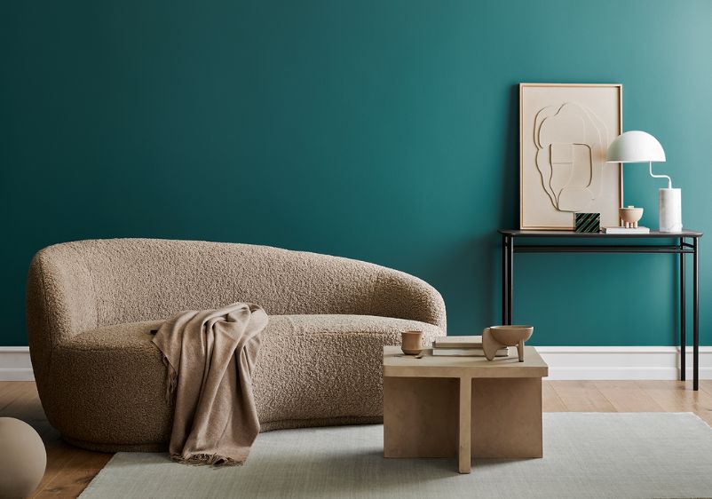


Turquoise walls add an instant air of luxury to any interior. Inspired by the gemstone from which it takes its name, turquoise is a glorious combination of blue and green, bringing the soothing properties of both colour families.
Muted turquoise can bring a calming energy to a room, while more intense shades can be used to add drama or create a stunning accent wall. Whatever shade you choose and however you plan on using it, knowing what colours to pair turquoise with is important.
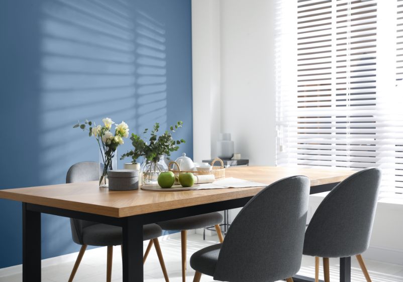
Creating a turquoise-centric colour scheme doesn’t have to be difficult. You can stick to natural wood towns and other lush shades like bright green. For a more understated colour combination, go with soft grey or mustard yellow. If you’re eager to make an impression, using navy blue as an accent colour is another good idea.
Still not sure about what colours to pick to perfect your colour scheme? We’ve got all the inspiration you’ll ever need.

Neutral
Malted Mint and Pearls And Lace
Even if you’re using a bright turquoise as your anchor colour, it’s easy to create balance with the right accent shades. Start with a light turquoise like Malted Mint. Infused with hints of blue and grey, it’s a surprisingly versatile offering from this green colour family.
As it’s a lighter hue, it’s best to use neutral colours to keep your decor schemes simple. A veiled neutral like Pearls And Lace is a good option. This shaded hue won’t distract from your signature turquoise, while red undertones bring warmth. If you’re a fan of more daring colour palettes, use those red undertones as your inspiration and add a few crimson accents to your space.
Among The Clouds and Cream and Sugar
Planning on using turquoise to refresh a bedroom or large living space? A light and airy shade like Among The Clouds is a good choice. This aquamarine hue will bring some tropical energy to your interiors, helping you escape the humdrum of daily life, even on the dreariest of days.
Of course, you’ll need the right accent colour to balance things out. A shaded beige like Cream And Sugar is a good choice. It can be used alongside other neutral shades if you want to bring more complexity to your colour scheme but stands strong on its own as well. Use neutral shades if you are adding more colour. Cosmetic hues will prove particularly welcome.

Grey
Magical Moonlight and Tahitian Treat
Are you keen to build a colour palette around turquoise? You’ll need the right shade to start with. A hue like Tahitian Treat will serve as a fabulous foundation for a turquoise-inspired space. Offering the same elegant character as turquoise jewellery, it’s a fairly dark shade that works well as a feature wall colour. It can even be used as an all-wall shade if you’re keen to use colour to create a cocooning effect.
As it’s so rich, a turquoise like this needs a softer shade to balance it out. Magical Moonlight is the ideal candidate. A subdued take on purple, this hue is enriched with notes of lavender. You can use similar tones if you want to create more complexity, with mauve working particularly well. For a more contemporary interior, use grey instead.
Malted Mint and Swirling Smoke
A lighter take on turquoise is the best choice if you’re decorating a smaller space. Whether it’s a living room, dining room or transitional space, a shade like Malted Mint is a good option. This light take on turquoise is enriched with blue and grey undertones, making it easy to decide on a direction for accent colours.
Any cool-toned shades will work beautifully alongside this hue. While blue and greys are the obvious choice, you can elevate your interiors with something like Swirling Smoke. A misty greige with hints of mahogany, it’s perfect for creating a more sophisticated aesthetic.

Off-White
Among The Clouds and Candle Smoke
If you’re worried that too much turquoise is going to overwhelm your interiors, dial things back with a lighter hue instead. Among The Clouds is a good choice for those who don’t want to experiment with saturated shades, with this bright take on turquoise boasting beautiful aquamarine undertones.
A true white like Candle Smoke makes a fine accent colour. Fresh and uplifting, this shade is infused with grey and blue undertones that make it the perfect pairing for those turquoise walls.
Tahitian Treat and Lonely Cloud
Want to create some drama with turquoise as your anchor colour? Start with a dark and intense shade like Tahitian Treat. Whether you’re using it for a turquoise accent wall or want to cover every vertical surface, it’s guaranteed to change the energy of any interior.
If you’re using this colour liberally, you’ll need something to balance it out. A nutty off-white like Lonely Cloud is a good choice. It brings all the qualities of standard white, while red undertones bring warmth. If you plan on using a lot of this, make sure you’re filling your room with plenty of turquoise accents. You can even add a few pieces of turquoise furniture if you’re feeling adventurous.

Yellow
Malted Mint and Dusty Blanket
Are you planning on using turquoise in the kitchen? This refreshing colour is a dream choice for your cooking space, especially if you favour contemporary aesthetics. Whether you’re thinking of turquoise cabinets or want to use this stylish colour to coat your walls, think about using a hue like Malted Mint. Light and airy, this shade is enriched with grey and blue, providing you with plenty of ideas for accent colours.
Rather than go with the usual cool tones, take a chance on sunny yellow instead. Dusty Blanket fits the bill nicely, with this pale neutral enriched with plenty of sunshine and a hint of hazel.
Malted Mint and Accolade
Are you tired of looking at drab white walls? A couple of coats of turquoise paint can remedy that. A lighter shade like Malted Mint will quickly elevate your space, with its cool undertones providing you with an easy choice of accent colours. It’s also pale enough that you can use it as an all-wall colour solution.
To create balance, go with another pale shade. A paint colour like Accolade is a good choice, with this distinct yellow paint colour guaranteed to liven things up with its lemon undertones. You can also use any green or blue shade to accentuate your key turquoise wall colour. If you want to add more of your favourite hue, why not invest in some new turquoise chairs or a few statement pieces?