


If you’re someone who instinctively reaches for bold shades and dramatic colour pairings, pastels aren’t the obvious choice when it comes to decorating a space. However, pastel colours are far from boring.
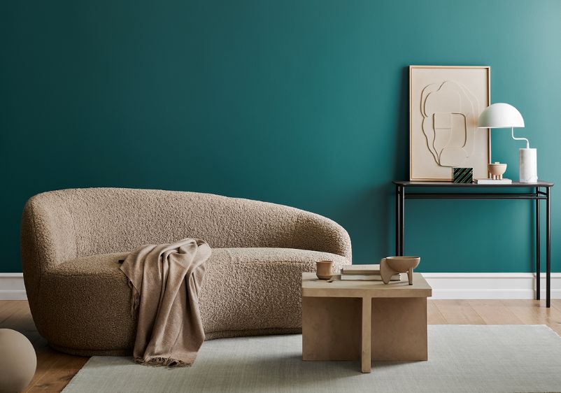
A pastel palette can bring a calming energy to a cluttered space, making them ideal if you’re hoping to create more soothing interiors. Pastels are also versatile. While many people choose to stick with neutral paint colours when decorating their homes with pastels, darker shades can be just as effective. Earthy tones and intense browns can ground pastels, while charcoal grey is perfect for creating a more sophisticated colour combination.
This eye-pleasing palette is ideal if you’re keen to embrace a more simple aesthetic, but don’t want to limit yourself to barely-there colour choices. If your room is lacking character, geometric prints and patterned soft furnishings can enhance the appeal of pastel walls.
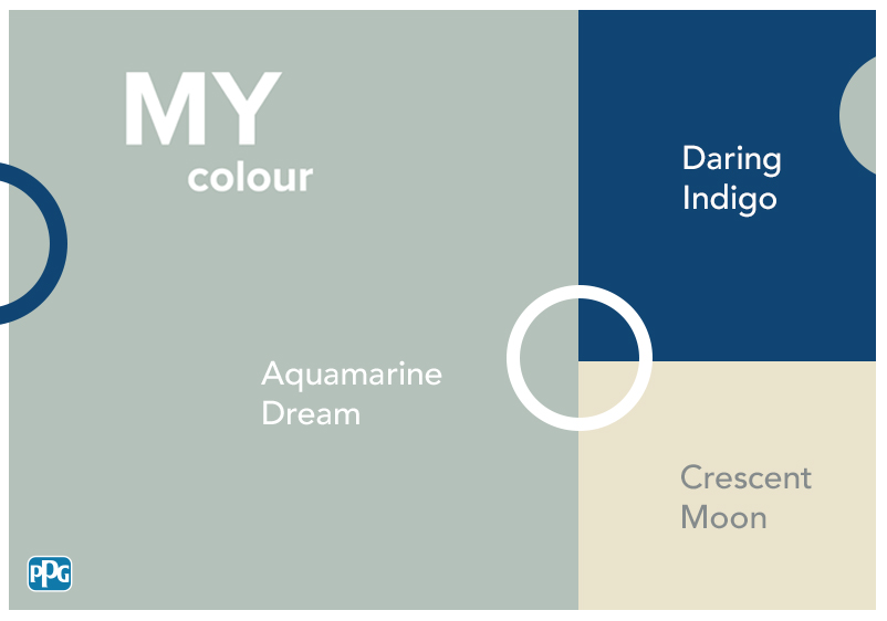
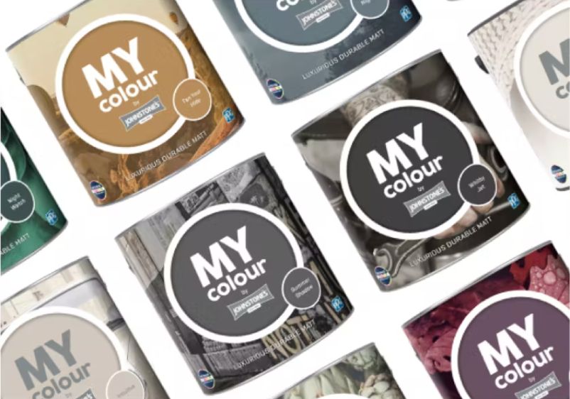
Our 14 Favourite Pastel Paint Colours
Whether you’re in the market for pastel pinks, pale yellows or tannish browns, you’ll find endless options in Johnstone’s collection of paint colours.
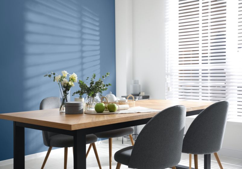
Blue Horizon
Blue Horizon
Blue Horizon is a light, pastel, baby blue
Blue Horizon
Blue Horizon is a light, pastel, baby blue


Baby blues are a staple of any pastel palette. If you’ve been searching for the ideal shade for a bedroom makeover, you’ll struggle to find a better colour choice than Blue Horizon. Light and fresh, it’s a versatile option that evokes the feeling of cloudless skies and summer mornings.
This pastel blue is strong enough that it can be used on its own. When it comes to colour trims, stick to the classics like pure white and light neutrals for decorating room mouldings.
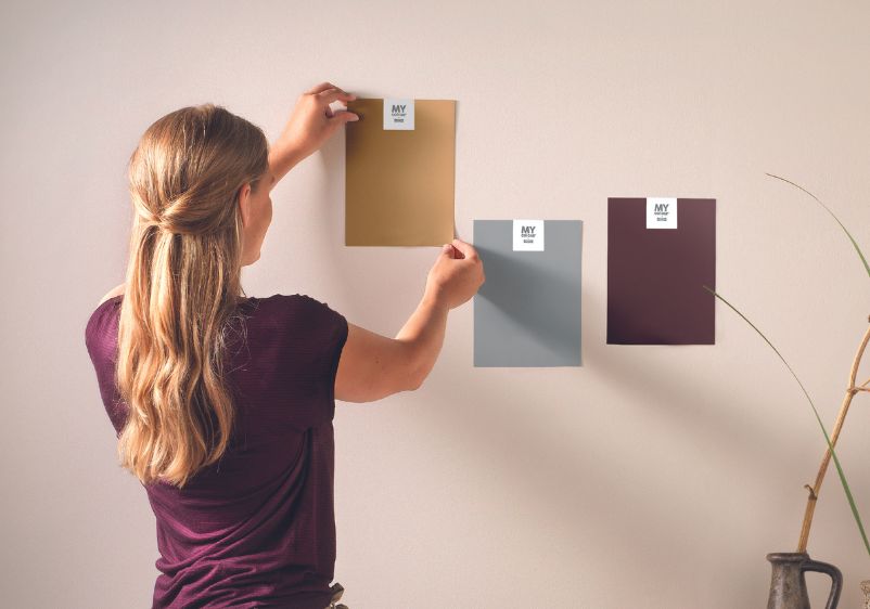
Tester Pots
- Featuring trend-led colours
- Try on different walls
- Made with 100% real paint
- Intense Colour Technology
- Luxurious durable matt finish
- Featuring trend-led colours
- Easy to apply
- Intense colour technology

Wild Bluebell
Wild Bluebell
Wild Bluebell is a light, pastel, muted, wedgewood blue
Wild Bluebell
Wild Bluebell is a light, pastel, muted, wedgewood blue

Pastel blues don’t have to be the reserve of nurseries and bedrooms. In fact, a more muted shade is perfect for tackling a redesign of a dining space or living room. A Wedgewood blue like Wild Bluebell is a terrific choice for older properties, with its muted tones ideal for enhancing period features.
However, this light pastel can also be used in more modern spaces. It works beautifully alongside contemporary furniture, such as high gloss sideboards or Scandi-style seating. Even a garden shed as pictured above.
Pale Seafoam
Pale Seafoam
Pastel foamy tropical turquoise aquamarine
Pale Seafoam
Pastel foamy tropical turquoise aquamarine

Just because you’re using pastels, doesn’t mean you can inject some tropical energy into your space. Pale Seafoam is a more intense take on pastel blue, with this turquoise aquamarine evoking the feeling of clear ocean waters.
Unlike other blue paints with cool undertones, this pastel blue will brighten up any interior. You can even use it in north-facing rooms to great effect. Keep to classic coordinating colours like timeless white, or turn to more muted blues for tonal combinations.
Silk Spa
Silk Spa
Silk Spa is a light, pastel, aqua blue
Silk Spa
Silk Spa is a light, pastel, aqua blue

Here’s another crowd-pleasing pastel blue that’s perfect for bringing some invigorating energy to a tired interior. Silk Spa is a lighter choice of pastel blue, but this aqua-infused shade will stand on its own if you’re planning on keeping things simple.
Alternatively, it’s a solid base for tonal decor schemes. Richer baby blues will work well alongside this pastel, while cooler hues and contemporary greys are other great choices. For a tried-and-tested combination, go with pure white every time.
Sleep Baby Sleep
Sleep Baby Sleep
Pastel light crystal lake blue
Sleep Baby Sleep
Pastel light crystal lake blue

If your bedroom decor isn’t doing anything for your sleep schedule, it’s time to explore the benefits of pastel blue. With its crystal blue character, Sleep Baby Sleep is just what you need to help you drift off at the end of a punishing day at the office.
As with any pastel blue, classic white is a dream pairing with this shade. However, creams and neutrals are also worth considering. It even works well as part of tonal interiors. Airy blues are the way to go if you’re looking for a more subtle combination, while sapphire shades will make more of a statement.
Citrus Spray
Citrus Spray
Delightful pastel pure clover green
Citrus Spray
Delightful pastel pure clover green

Pastel shades can be surprisingly versatile. While Citrus Spray is a subdued colour choice, this clover green is incredibly refreshing and leaves you with a heap of options when it comes to selecting coordinating shades.
While you’ll want to keep things fairly low-key when selecting those complementary colours, you can make all the same matches as you would if you were using a more verdant green. Delicate blues are a good fit here, while uplifting yellows are another good choice.
Frozen Salt
Frozen Salt
Pure pastel jewelled teal aqua-green
Frozen Salt
Pure pastel jewelled teal aqua-green

If you have your eye on a more luxurious take on pastel blue, Frozen Salt is something that might appeal. This jewelled teal tone is fresh and vibrant, making it a good option for kitchens and bathrooms.
You can also use it in living spaces and dining rooms. It works incredibly well alongside pure white ceilings and room mouldings. If you’re considering using multiple pastels, try experimenting with other aqua-greens for a terrific tonal combination.
Mellow Mint
Mellow Mint
Minty pastel chartreuse green
Mellow Mint
Minty pastel chartreuse green

Pastel greens are perfect for bedrooms and laid-back living spaces. Mellow Mint lives up to its name, with a herbaceous colour profile that’s enriched with plenty of chartreuse energy.
Because of its versatility, you can use this pastel green in almost any room. If you’re a fan of modern design, this pastel pairs well with muted greys and neutral shades. However, it will also serve as a stylish backdrop for natural materials and warm-toned woods like cherry and mahogany.
Pastel Paper
Pastel Paper
Pastel taupe orange with undertone pink
Pastel Paper
Pastel taupe orange with undertone pink

Even the lightest pastel can add warmth and uplifting energy to a room. Pastel Paper is an ideal choice for living spaces and bedrooms, with this taupe orange helping enhance the colour temperature of your interiors.
There are also some pink undertones at play with this pastel. If standard white doesn’t appeal to you, consider using blush shades and berry tones to spruce up things like room mouldings.
Golden Mushroom
Golden Mushroom
Pastel sun-soaked golden peach
Golden Mushroom
Pastel sun-soaked golden peach

Some of the finest pastels veer closer to dusky shades. Golden Mushroom is a perfect example. This peach-infused pastel is sultry and stylish, making it an ideal pick for painting walls in a more sophisticated space.
This eye-catching pastel will look right at home in a more sophisticated living space. You can use skin-kissed yellows or lemon-infused neutrals to add extra warmth. If you’d prefer a more subdued interior, consider adding dusky pinks and periwinkle shades to your palette.
Vanilla Burst
Vanilla Burst
Vanilla Burst is a light, pale, pastel, butter yellow
Vanilla Burst
Vanilla Burst is a light, pale, pastel, butter yellow

While many pastels are fairly reserved, the same can’t be said of Vanilla Burst. This butter-yellow pastel will brighten up any interior. It’s ideal for south-facing rooms but can be used just as well in spaces that receive relatively little direct sunlight.
It’s up to you which direction to take when selecting coordinating colours. Intense cherries and burgundy reds will work well alongside more dramatic decor schemes. However, lighter pastels are also worth considering if you’re thinking about a low-key tonal palette.
Baby Blossom
Baby Blossom
Baby Blossom is a light, pastel, lilac, rose pink
Baby Blossom
Baby Blossom is a light, pastel, lilac, rose pink

For those searching for a timeless pastel with bags of feminine charm, there’s Baby Blossom. Although this pastel is fairly light, it offers plenty of depth. More than a hint of lilac and plenty of rose pink make this one a go-to if you’re aiming to change the character of a space.
Anything from the purple or pink colour families will make effortless companions to this pastel. For a more sophisticated space, try working in iced greys and dusty pinks.
Pleasing Pink
Pleasing Pink
Blushy light pastel cerise rose-pink
Pleasing Pink
Blushy light pastel cerise rose-pink

Blush colours and pastels are a match made in heaven. Pleasing Pink has elements of both, with this cerise shade bringing charm and elegance to any room. It works beautifully alongside other rose pinks, but also shines when used with blush hues.
For a timeless decor scheme, stick to neutral greys or greige as an accent colour. For added luxury, think about incorporating silvery shades and refined berry tones. If this pastel pink is too intense to use on every surface, why not use it for a feature wall instead?
Pastel Plum
Pastel Plum
Shaded violet purple with a dash of mauve
Pastel Plum
Shaded violet purple with a dash of mauve

At first glance, you’d be forgiven for thinking this paint colour wasn’t a pastel at all. However, Pastel Plum is exactly that. This irresistible violet is one of the most elegant colour choices in our range. Rich and intense, there’s a hint of mauve here for added complexity.
This pastel will serve as the backbone of any interior colour scheme. You can stick to a single accent colour to tackle things like ceilings and room mouldings. To make things more interesting, try a tonal scheme with muted mulberries, powdery violets and peony purples.