


Not everyone’s a fan of saturated colours. However, this doesn’t mean you have to limit yourself to an off-white palette when it comes to wall paint. Muted colours let you introduce a variety of gorgeous shades to your home, without overwhelming your walls or causing conflict with your existing decor.
If you’re struggling to settle on a colour scheme for your interiors, muted tones are the ideal compromise. With muted shades, you’re free to explore the entire colour spectrum, without worrying about tonal clashes. Use a muted colour palette as a foundation for your next painting project, then introduce more vivid colours sporadically.
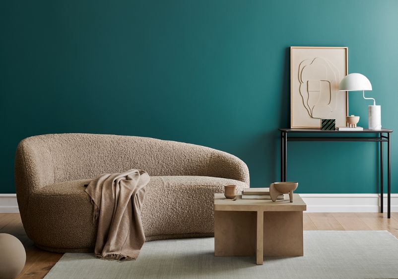
Muted and subtle colours are also soothing. Blue, green and grey tones are ideal for creating a calming and relaxing ambience in any room. These complementary colours have long been a staple of Scandi interiors, but they work with just about any decorating style.
Tester Pots
- Featuring trend-led colours
- Try on different walls
- Made with 100% real paint
- Intense Colour Technology
- Luxurious durable matt finish
- Featuring trend-led colours
- Easy to apply
- Intense colour technology

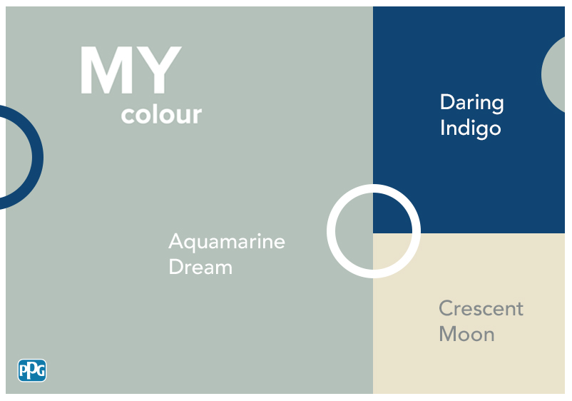
12 Soothing Muted Paint Colours
Whether you’re creating a cutting-edge contemporary interior or something more traditional, a muted colour scheme is the way forward. Looking for a muted version of a beloved bright red or sun-drenched yellow? At Johnstone’s, you’ll find plenty of fabulous muted hues for every project.
Morning Skyline
Morning Skyline
Morning Skyline

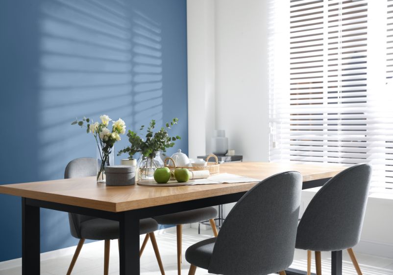
Just because bright colours aren’t your thing, doesn’t mean you can’t illuminate your interiors with stylish shades. Take this colour for example. Morning Skyline brings all the beauty of more saturated blues, with this evoking the feeling of crystal clear waters. While it’s muted compared to other tones from the blue family, this hue can make an impression in its own right.
You can use it alongside natural colours for a more neutral interior. If you’re keen to experiment with a variety of tones, use it as a complementary colour alongside grey or beige. It even works exceptionally well alongside brighter colours. If your tastes are more contemporary, try using it alongside vibrant shades of orange or rich reds.
Mountain Wind
Mountain Wind
Mountain Wind

A saturated colour can overwhelm a smaller space, especially if your room doesn’t receive much natural light. However, this doesn’t mean you have to stick with pure white or lukewarm neutrals. Mountain Wind is ideal for spaces that need a major refresh. This aqua blue is on the pale side, but there’s enough colour saturation here to add some flavour to your interiors.
If you want to evoke the feeling of a bright and sunny day, you have plenty of colour combination options. Try pairing it with a muted yellow and a warm white to enhance what’s already there. If you’re decorating a larger room and want to create a focal point, play around with tonality and use a silvery blue for an accent wall.
Mental Note
Mental Note
Mental Note

Muted colours will also work well in the bedroom. If your current bedroom decor is making it hard to relax, it’s time to rethink your colour palette. Mental Note is the ideal tone for clearing your mind and promoting a sense of well-being. This pale green is fresh and invigorating, but it’s a low-profile palette addition that won’t leave a smaller space feeling saturated with colour.
This muted green is also adaptable to just about any decorating style. With its grey undertones, it’s an easy fit with contemporary decor schemes. However, this versatile shade can also be used alongside more classic room accents and traditional furniture. Coordinating with this green is easy enough. You can use a variety of green hues for a tonal palette, or reach for complementary shades when selecting surrounding colours.
Magical Melon
Magical Melon
Magical Melon

Muted paint colours are the preferred choice for many people who prefer a more modern and pared-back interior. Magical Melon is one of the finest examples in our range. Although this chartreuse shade is on the subtle side, it brings all the qualities you’d want from a green paint colour. It’ll leave a living room feeling warm and welcoming, while its botanical tones will enrich kitchens and bathrooms.
Thanks to its versatility, you’re free to use this gorgeous green as you wish. You can keep your colour scheme basic by pairing it with an off-white accent shade. However, it can also be deployed alongside other hues from the green colour family. For more variety, try pairing it with toned-down limes or aloe-infused colours.
Herbal Mist
Herbal Mist
Herbal Mist

The right shade of green can bring serenity to a space. If you’re decorating a bedroom or revamping a home office, a muted green is a great idea. Herbal Mist is a beautiful colour option. This crisp clover green might be mild, but it holds its own alongside more saturated shades. It’s the perfect primary colour for just about any room, but it can also be paired with honeydew greens and lime-infused hues.
This subdued shade can be put to use in any home. Although muted, it’s a fairly rich shade that will look stunning in a period property with ornate finishes. However, it’s a fine alternative to contemporary staples like greige and mushroom. If a modern space needs an overhaul, dare to go green instead.
Country Porch
Country Porch
Country Porch

Blush colours are some of the best muted paint colours around. Although they’re subtle, they don’t disappoint when it comes to sophistication. Country Porch is a perfect example of what a blush shade can do for a space. This muted tangerine can be used in place of more fiery oranges, granting warmth and elegance to your interiors.
Putting together a jaw-dropping colour scheme is easy when you start with a shade like this one. You can bring in other blush tones to enrich what’s already there, or play around with pastels for a similar effect. If you’re using blush because you’re a fan of a more refined aesthetic, go with luxurious finishing touches. Gold and metallics are a great match for blush shades, although classic monochromes can also make an impact.
Canyon Peach
Canyon Peach
Canyon Peach

Scorching reds and lush citrus colours are tempting if you’re trying to bring warmth to a room. However, you don’t need to use saturated colours to bring heat to your interiors. Although Canyon Peach is a relatively mild shade, this carrot orange will bring passion and colour intensity to your spaces.
Thanks to its peach tints, this beautiful blush works nicely with other subdued shades. You can team it with toned-down corals or sandy hues for a more simple colour scheme. Go-to complementary colours like grey and beige will also sit perfectly well alongside this one.
Pink Pail
Pink Pail
Pink Pail

Some muted shades are more vibrant than others. While Pink Pail will work well as part of any low-profile colour palette, it won’t disappoint if you’re searching for a playful tone to revamp your rooms. This premium pink combines cerise and rose qualities, making it surprisingly complex for such a subtle shade.
Because of its depth, this pink can be used on its own. However, it will really sing when used alongside other pink-infused tones. Magenta, fuchsia and berry tones will all enhance this complex paint colour. For more refined interiors, use dusty hues and silvery pinks to bring things together.
Brick Path
Brick Path
Brick Path

Muted colours can make a real impact. Brick Path might be more saturated than other paint colours in our range, but this subtle shade can still be used liberally as part of a pared-back colour scheme. Perfect for those keen to use red, this muted coral is enriched with a raspberry tint, making it the ideal option if you’re eager to bring warmth and intensity to your walls.
If you’re desperate to inject your interiors with colour, pair it with rusty reds and spicy tones. Dark berry shades and earthy hues can also be used alongside it. If you’re not sold on the idea of using this one on every surface, use it for an accent wall and pair it with a warm white or red-infused neutral.
Candlewick
Candlewick
Candlewick

Does a morning room need a makeover? Kitchens and dining spaces can feel washed out and lacking life if you’ve chosen the wrong wall colour. Something like Candlewick will work beautifully in those spaces that are flooded with sunlight come the break of day. Although this is a muted shade, it’s enriched with sunny citrus notes, with a backbone of mustard yellow adding some sophistication.
If you’re someone who usually goes for neutral colours, you won’t need much convincing to experiment with this enchanting shade. It’s incredibly versatile, working as a backdrop for contemporary interiors and more classic furniture pieces and architectural details.
Still Lake
Still Lake
Still Lake

If you’re on the hunt for moody paint colours, muted tones have plenty to offer. Still Lake is an enticing option for bedrooms and relaxing living spaces. This lavender purple has a mysterious, dreamlike quality that will help clear your head and put the day behind you.
This serene lavender is also easy to decorate with. It makes enough of an impression that you don’t have to bring in other shades to complete a colour scheme. However, if you are keen to add complexity to your room palette, you have endless options. To keep things tonal, try using hues like periwinkle, lilac and violet.
Iridescence
Iridescence
Iridescence

Looking to make use of lavender? Iridescence is a good call if floral-inspired shades are your thing. Light and undemanding, it’s a wonderful choice for any wall. You can use it in bedrooms, living spaces or bathrooms.
As with other lavenders and light purple hues, colour pairing with this shade is easy. Classic colour companions like white will always work well. However, neutrals infused with grey, purple or blue should sit comfortably alongside this irresistible shade.