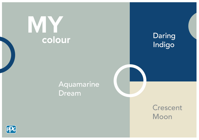


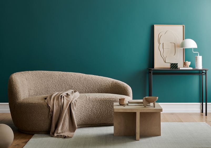


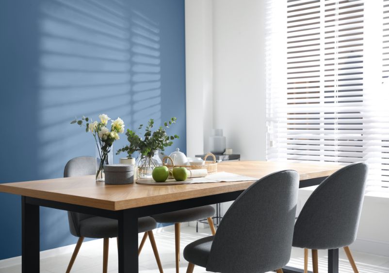

If you’re someone who finds it hard to choose between the serene appeal of green hues and the refreshing qualities of blue, aqua blue paint colours are the way forward. Combining the best elements of both classic colour families, aqua blue paints are a terrific choice for bringing a sense of tranquillity to your interiors.
Tired of staring at a white background? Why not use a light take on aqua blue to create a beautiful blank canvas instead? Alternatively, use more vibrant aqua blues to make a statement. A particularly striking shade, aqua blue has an innate glow about it that will breathe new life into a bedroom, living space or dining room.
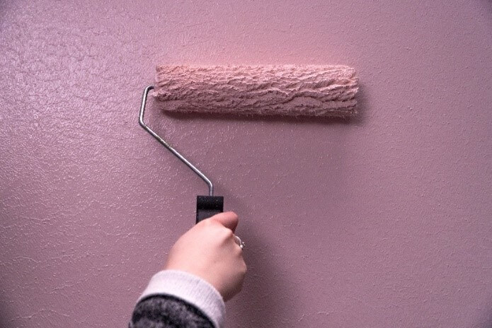
Reach for your roller and use aqua blue hues for long-overdue bathroom makeovers. Alternatively, use turquoise-infused tones to transform your kitchen. Once you’ve used aqua blue, you’ll find yourself coming up with new ways to incorporate it into your decorating projects.
Teal Bayou
Teal Bayou
Teal Bayou

If you’re out to make a statement with your latest decorating project, there’s no better colour choice than aqua blue. Teal Bayou is a saturated take on tropical turquoise, with this inspiring aqua blue guaranteed to bring new life to any interior.
Suitable for use on all of your surfaces, why not use it in the bathroom if you’re keen to ditch the usual baby blues? Have you taken stock of your kitchen and decided it’s time for a redesign? This intense shade looks superb alongside stainless steel and contemporary units, but also pairs well with traditional white cabinetry. If you’re eager to experiment with tonal decorating, why not introduce your brush to other daring shades from the blue colour family?
Ocean Turquoise
Ocean Turquoise
Ocean Turquoise

If you’re searching for a shade with an unmistakable marine quality, take a second look at Ocean Turquoise. This saturated hue evokes the feeling of the big blue, with its serene undertones making it a gorgeous addition to any surface.
If you want to bring some tropical luxury to your interiors, this is a fine choice of wall colour. You can use it as an anchor colour in spaces like bathrooms, with this bold blue pairing well with white suites and chrome fixtures. Do you love what you see but aren’t convinced that your space can take this much colour? Rather than overwhelm your space, be more sparing when using it. It’s a classic choice of accent colours, with staple shades like grey working nicely alongside it.
Biscay Bay
Biscay Bay
Biscay Bay

With the right shade of aqua blue, you can almost feel the ocean spray on your face and hear the breaking of waves. Bright and saturated, Biscay Bay is a turquoise-infused classic with aquamarine undertones, making it a vibrant addition to any interior. Compatible with most decorating styles and architectural eras, you can use this paint colour equally well in a period property or contemporary home.
It’s an ideal pick if you’re seeking a dramatic shade to anchor a living room colour scheme. Do you dream of a dining space that will be the envy of your social circle? With an inspiring hue like this, you can turn even the drabbest dining room into a stylish space for socialising. It might be intense, but creating a colour palette with this shade is easy. Use pale greys and materials like glass for a balanced aesthetic. Alternatively, use accent colours like dusty pink to bring warmth.
Swan Lake
Swan Lake
Swan Lake

Light and bright, Swan Lake is a great choice if your other aqua blues are a bit too intense for your tastes. With its teal qualities and jewel undertones, it’s perfect for bringing a sense of serenity to your interiors. It’s an understated take on aqua blue, ensuring it won’t prove too much for those smaller spaces.
It’s also more versatile than its more saturated counterparts. You can use it alongside all manner of blues and cooler hues for tonal decorating projects. As far as colour schemes go, take note of all the usual accents you’ve used when decorating with blue before. Standard white is the obvious choice here. If you want to add more variety to your interiors, consider your choice of materials. Organic ones work best, so look to nature for inspiration and pick out premium wood furniture instead of second-rate veneer whenever possible.
Aqua Tint
Aqua Tint
Aqua Tint

Here’s another pale aqua blue that will effortlessly enhance an interior. With its tropical turquoise character and aquamarine undertones, Aqua Tint is a subtle shade that will make a low-key addition to any surface. You can use it in every room of the home, especially in those spaces that need a lighter hue to help them feel bigger.
What’s more, it doesn’t have to be reserved for walls alone. Does your ceiling need a spruce-up? Rather than steal attention from the beautiful blues you’ve used to coat your walls with a flat white, use this turquoise-infused shade instead. For best results, use it alongside other aqua shades to create a stunning tonal interior that will help clear your head and create a more harmonious home.
Kiss Me Kate
Kiss Me Kate
Kiss Me Kate

While Kiss Me Kate is a fairly pale take on aqua blue, it’s by no means lacking in character and vibrancy. Bright and uplifting, this marine blue is enriched with watery undertones and can be used for all manner of decorating projects. Cool and contemporary, this aqua blue can be put to use in any room that demands a design refresh.
As this is a subtle shade, it can work well in rooms of any size. It’s perfect for poky bedrooms or second bathrooms that you’ve neglected for far too long. You can even use it in living rooms if you’re in the mood for a cool-toned design makeover. However, you’ll want to bring in some warmer notes so that your living space doesn’t feel too cool and uninviting. Oranges and citrus hues are always an effective choice for this.
Blast Of Cold
Blast Of Cold
Blast Of Cold

Are you searching for a sleepy shade that will help clear your head at the end of a hectic day? A pale aqua blue like Blast Of Cold is a good choice. Ideal for bedroom makeovers, this pure blue hue is a serene addition to any colour scheme. What’s more, it’s light enough that you don’t need to worry about your space being too small to accommodate it.
As with any blue, it has a cooler quality about it. However, rather than leaving your spaces feeling sterile, it promotes a refreshing sense of calm instead. You can stick to simple accents when finalising your colour scheme. White trims will always work well alongside cool blues like this one. If you favour more contemporary aesthetics, think about using a dramatic grey or metallics instead.