


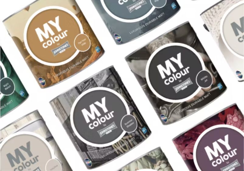

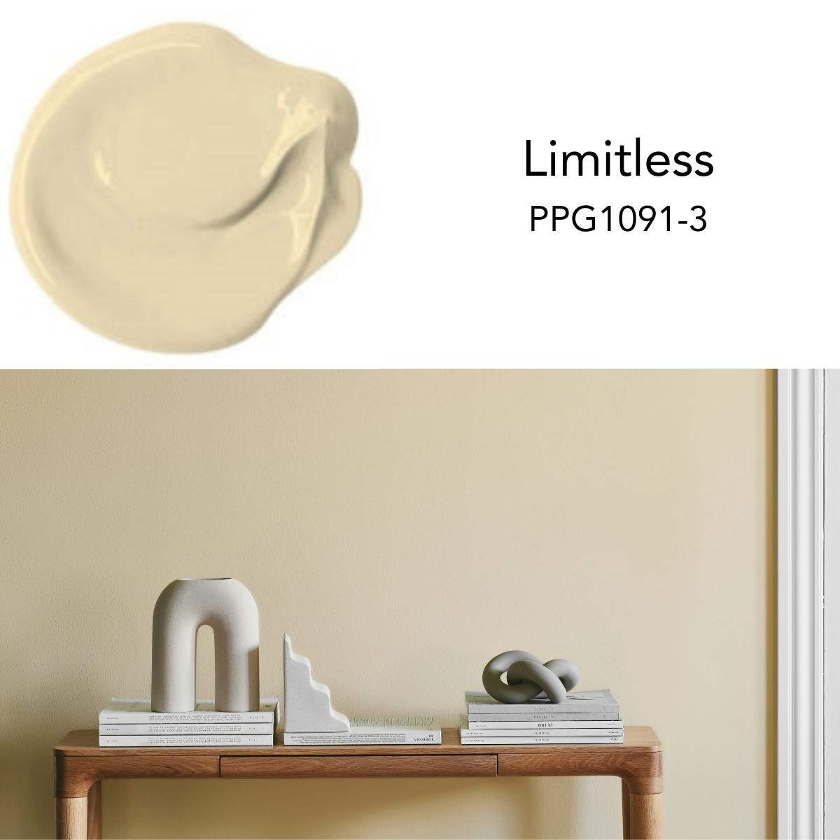
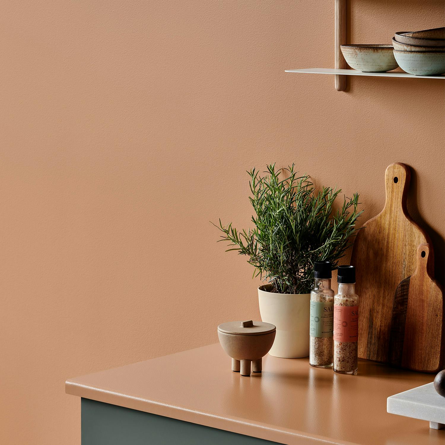
MY colour by Johnstone’s introduces the 2024 Colour Of The Year
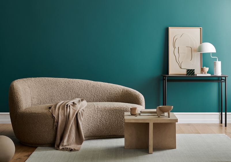
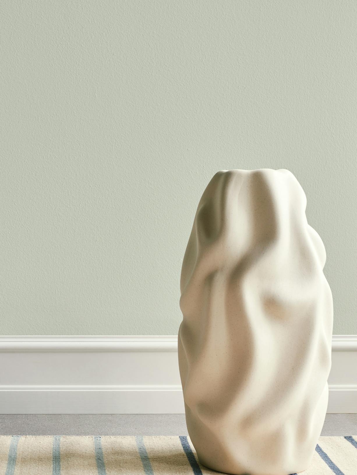
Limitless is a soft, muted, warm honey beige with a mustard yellow undertone, this timeless hue inspires endless possibilities. From neutral to bold and from historical to retro palettes, with Limitless and the three accompanying inspirational palettes, Johnstone’s develops a more personal view of colour.
This paint colour is perfect for a Tuscan-styled room. Combine it with white or deep-toned trim and dress it down with Tuscan prints of pale yellows and blues.
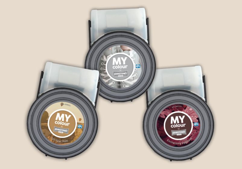
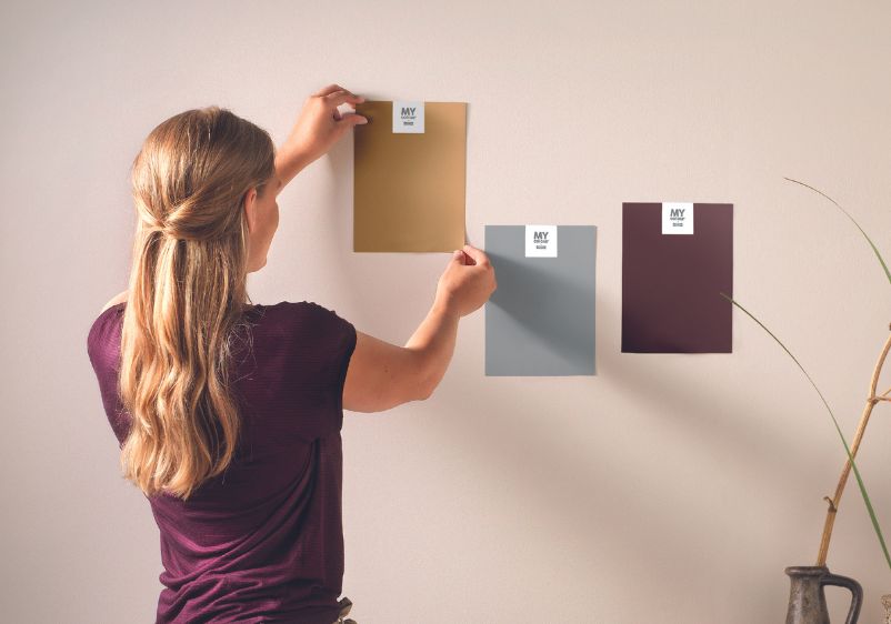
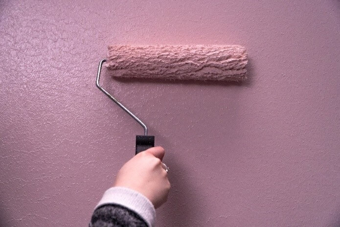
Head to the MY colour app to discover complementary colour palettes and order your Tester Pot
2024 Colour Trends
We are entering a new era of explosive change and creativity, the next decade will see significant shifts in the way we communicate, we work, our health, creativity and design and even how we share our identities with the world. The 2024 trend themes focus on three inspired colour palettes.
Volume I
Internal Worlds
Volume 1 focuses on oneself and looking inward. Consumers are increasingly focused on their social well-being, mental and emotional state and putting this at the forefront.
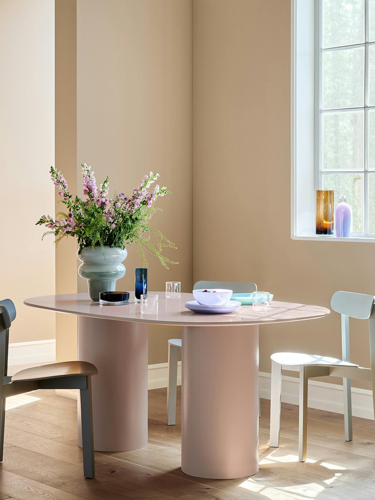
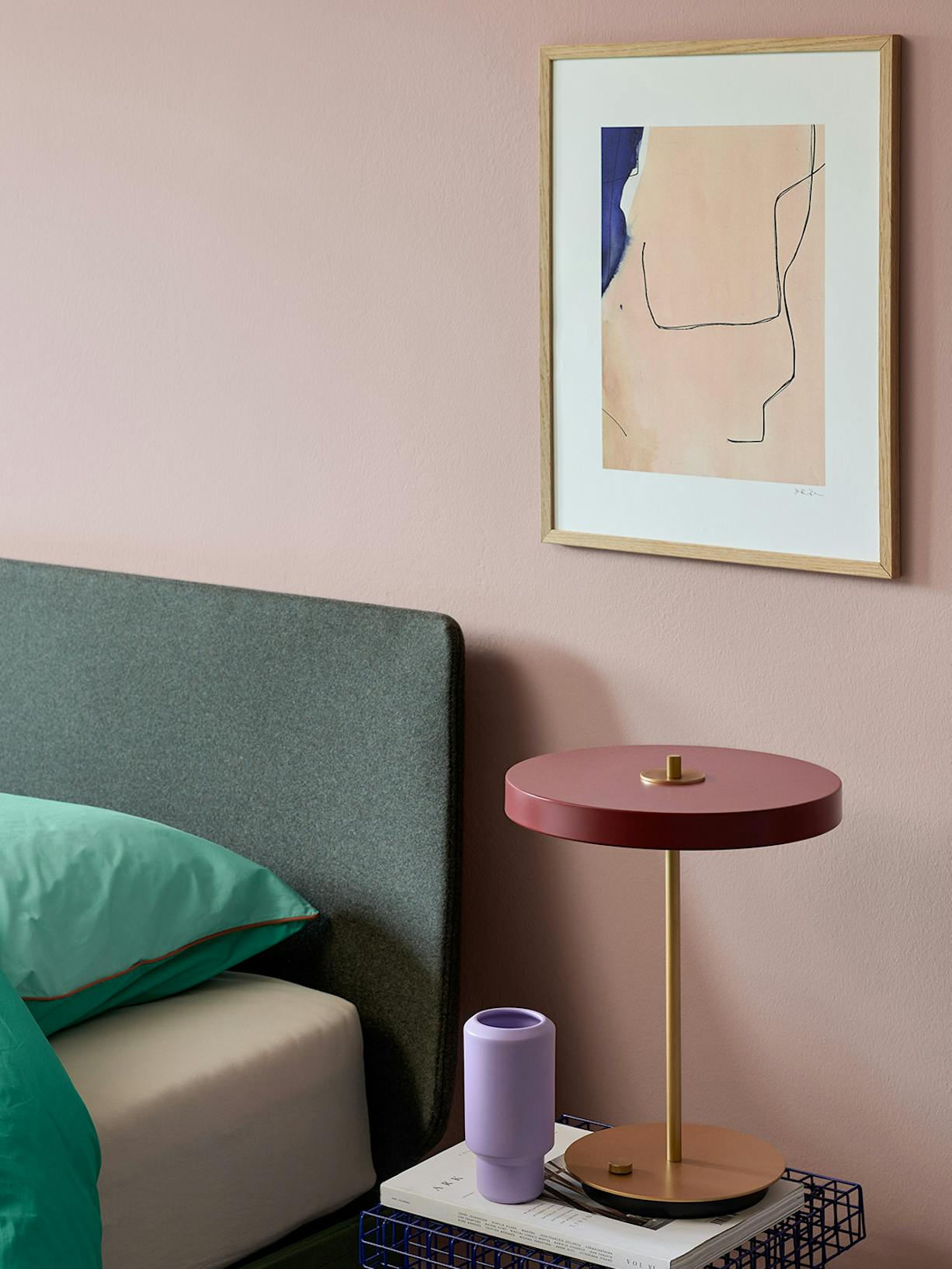
It consists of calm and soothing tones which are offset by earthy and twilight shades. For example, combine the soothing Jam Session, the grey-blue Nightcap and Colour of the Year Limitless, a soft yellow, to create a tender and fluid mix for an aesthetic look.
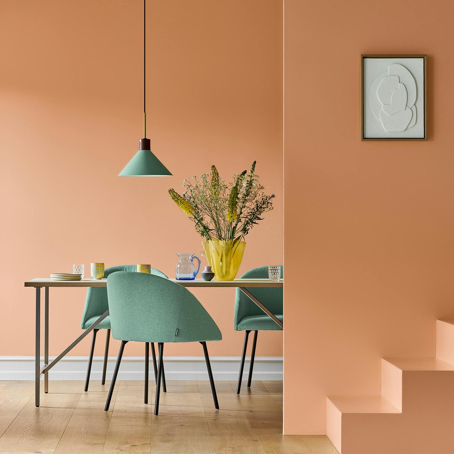
Volume II
Nature's Partner
Volume 2 focuses on transformation and the symbiotic relationship between man and nature. It consists of a range of natural and earthy greens paired with warm and floral hues – this palette is energised by lively blues and balanced by dark neutrals.
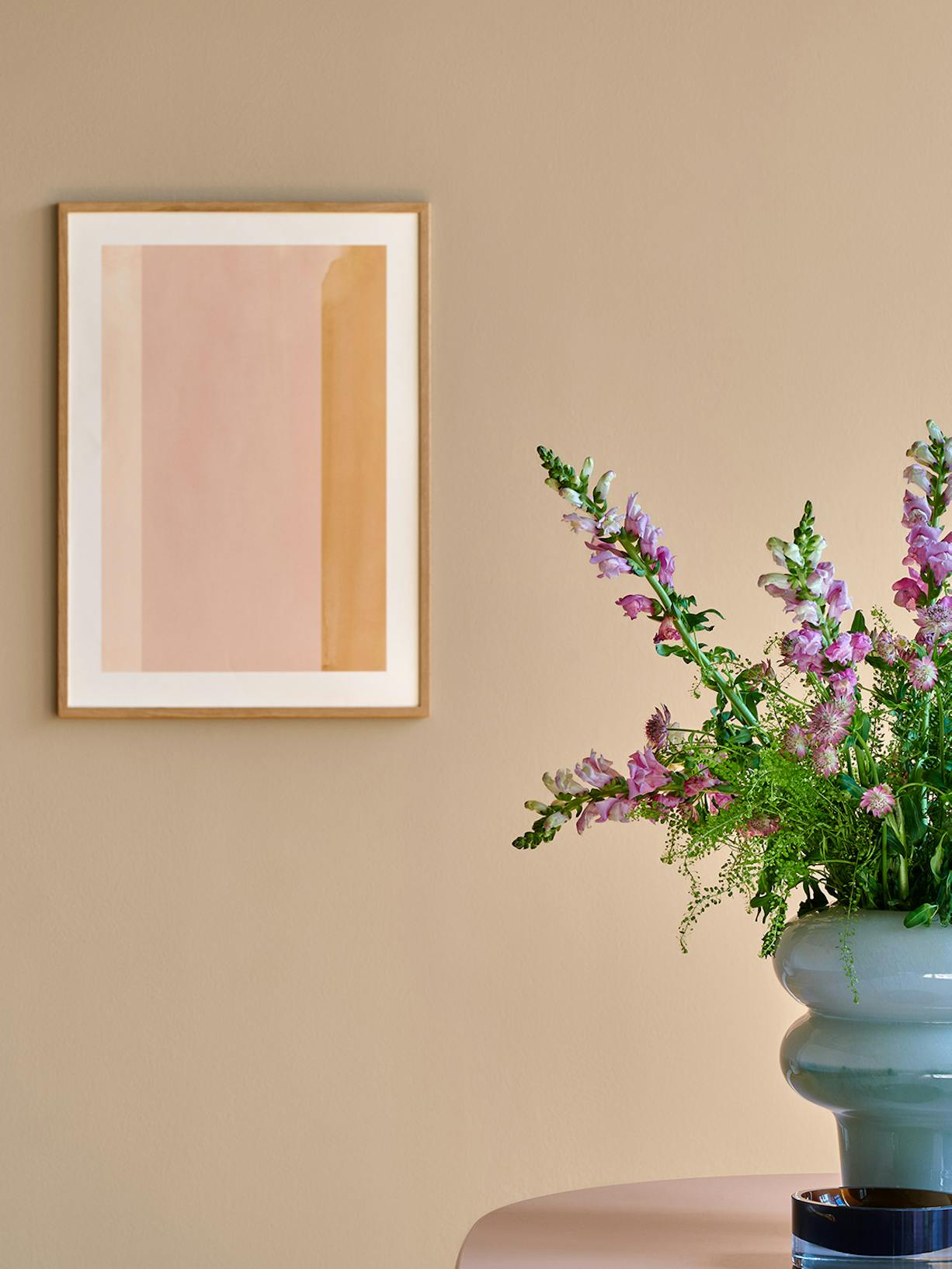
In this palette Limitless gives a warm, sunny atmosphere that stands for growth and flowering.
Volume III
The New Eccentrics
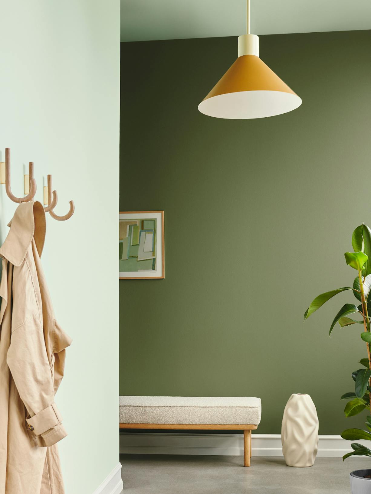
Contemporary design meets classical elements in Volume 3, with a strong emphasis on dark palettes with a shift from light spaces into dark. Volume 3 challenges what we know, enabling us to be happy in the face of adversity and create life on our own terms.
The palette references popular hues from Pop Art, Renaissance, Art Deco and Baroque periods. Volume 3 focuses on reinventing and defying the world at large.
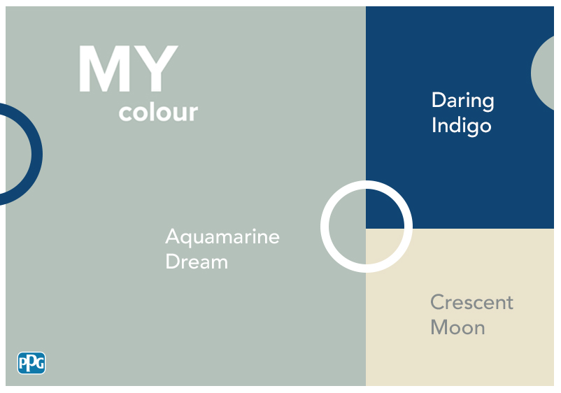
Combine the Colour of the Year with the deep blue of Daring Indigo, wine red Bramble Jelly and the golden Turner’s Yellow for a classic style with a contemporary atmosphere.
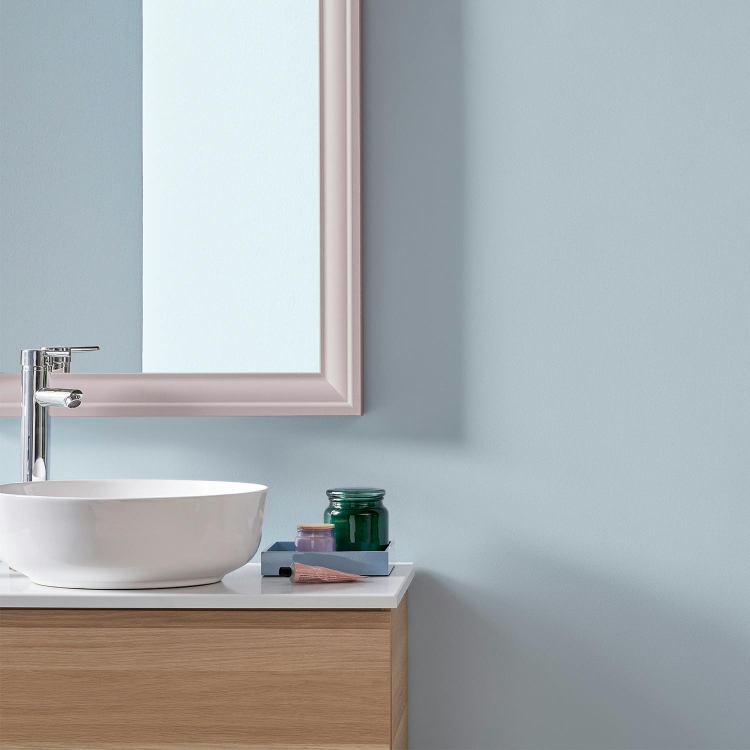
2023 Colour Of The Year
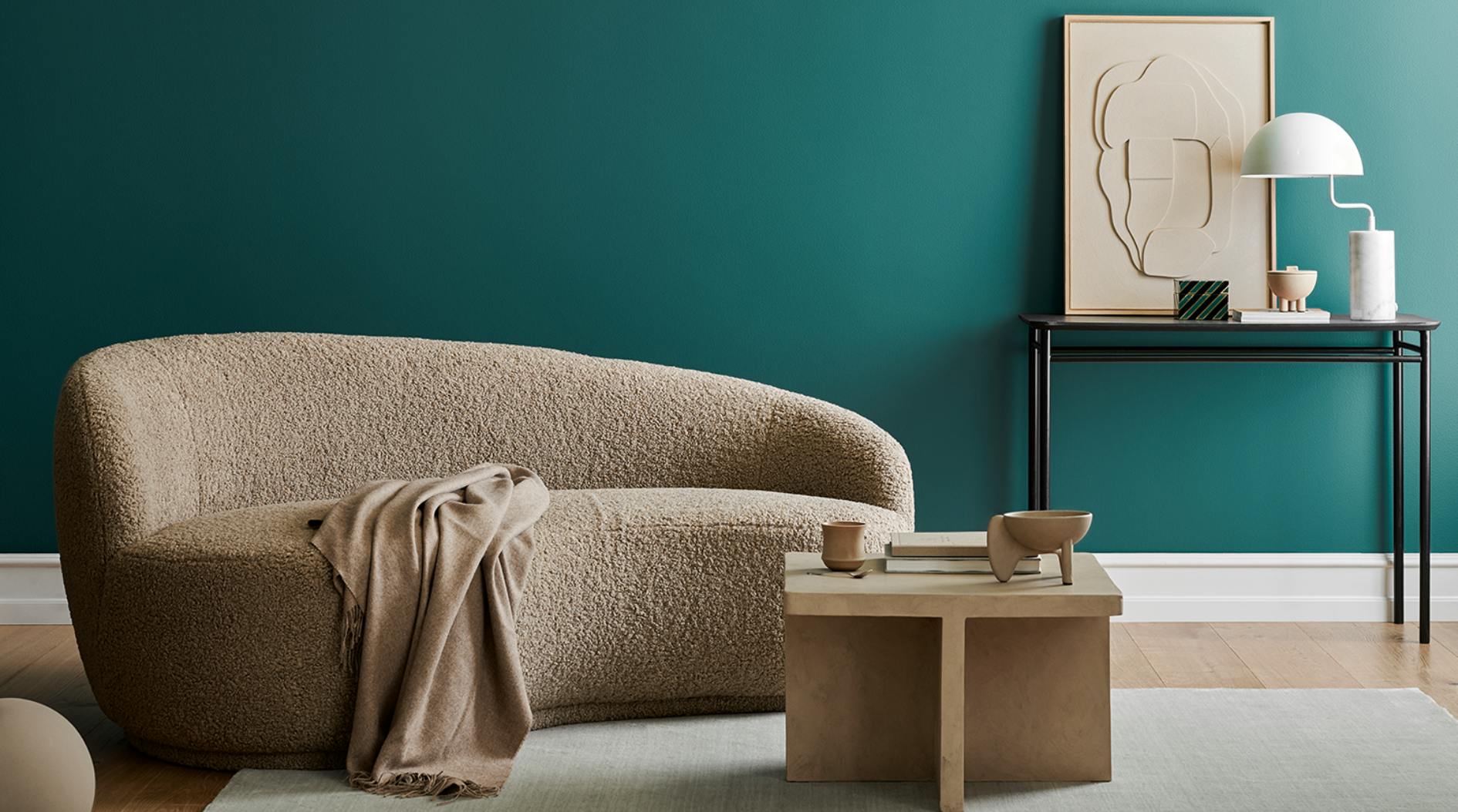
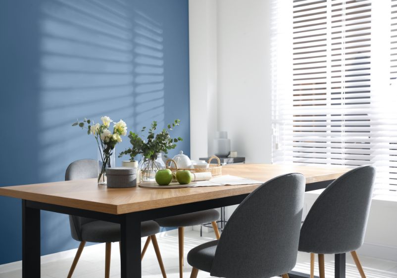
Vining Ivy PPG1148-6
Vining Ivy is a deep, shaded, caribbean aqua and can be viewed as classic, elegant or traditional. The turquoise tint is both modern and versatile. Vining Ivy brings together a powerful blue with delicate green to create a colour that will bring a feeling of both calmness and energy to your home.
The combination of blue and green hues creates a rich, modern colour that brings out the best in any interior, whilst still providing a balanced colour for the outdoors. You can combine it with deeper wood tints and off-whites to create a natural effect to give a luxurious look and feel.
Head to the MY colour app to visualise how this colour would look in your home.
2023 Colour Trends
Serenity
The serenity trend palette is a relaxing design theme that allows for reflection and provides a calm space to live in.
A graceful palette of milky pastels, watery tones and warm neutrals.
Use the serenity palette as inspiration to create a neutral interior with subtle tone-on-tone hues and milky pastel accents.
Origin
The origin palette is a natural trend that represents the relationship with the environment that surrounds us.
The earthy and the cosmic intercept is represented in this well-balanced palette.
As if pulled or mined from the earth, these colours are inspired by metal, minerals and clay and can be used throughout your home to create a nature-led interior.
Duality
The duality palette is a vibrant scheme that celebrates the dynamic relationship with the world. Contrasts abound in this extroverted palette of brights, clean pastels and strong neutrals.
Use these colours in your home as accent colours to add a sense of playfulness or take a maximalist approach and use these colours throughout your home to amplify the drama.