


If you’re searching for some interior design inspiration and aren’t afraid of experimenting with vintage aesthetics, the 1930s is a period well worth investigating. This dynamic decade was dominated by two distinct design trends, with the luxurious aesthetics of Art Deco decor giving way to the understated elegance of Streamline Moderne.
Art Deco aesthetics are instantly recognisable, with the decorating trend remaining popular to this day. First becoming popular in the 1920s, the Art Deco movement put a big focus on gold accents, geometric shapes, patterned wallpaper, and sophisticated sculpture.
Streamline Moderne would follow, with this American trend lifting many elements from Art Deco. However, there was a shift toward the functional, with Streamline Moderne also boasting obvious industrial inspirations.
Both design trends had distinct colour palettes. Art Deco was all about vibrant shades of blue, red, and green, with metallics also being a hallmark. Streamline Moderne colour schemes were more eclectic, ranging from subdued palettes to more daring colour combinations that incorporated striking monochromes, intense orange paint colours, and more.
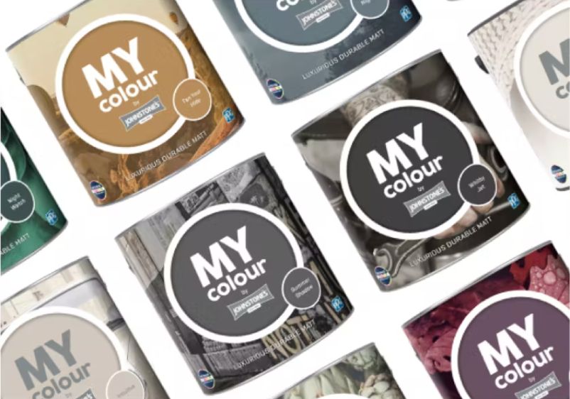
Paint Colours Associated with the 1930s
Looking to refresh your walls with vintage shades inspired by the 1930s? Whether you’re looking to weave the appeal of the Art Deco movement throughout your home or use Streamline Moderne to transform your favourite room, there are plenty of authentic colour choices to choose from.
Deep Reds
Rusty Wool
Canyon Stone
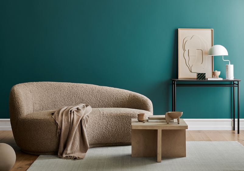
Rich reds came into their own during the 1930s. A hallmark of Art Deco interiors and a staple of Streamline Moderne spaces, deep reds are just the thing if you’re looking to saturate an interior and create drama or make a statement with feature walls. Ideal for bedrooms, dining rooms, and living spaces alike, deep reds are a first-rate foundation for any 1930s space.
Not every deep red has to be overwhelmingly intense. Take Rusty Wool as an example. This subdued Merlot red is a good choice if you’re of wine-inspired hues. An oaky tint adds depth and complexity, providing you with an anchor for introducing earthy shades to your palette.
Any red will add warmth to your interiors, but some turn up the heat better than others. Canyon Stone will make an excellent addition to a space that’s lacking in sunlight or doesn’t feel particularly inviting. Its spiced tone makes it an ideal choice for living rooms, while its shaded qualities make it a versatile addition to almost any space.
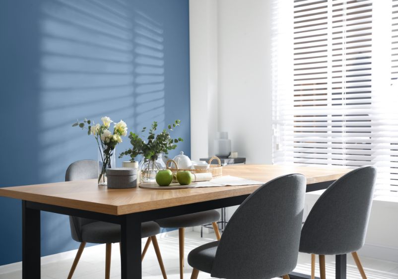
Delicate Blues
Arctic Dawn
Clear Your Mind
If you’re keen to capture the slightly more subdued aesthetic of Streamline Moderne, think about using delicate blues to anchor your colour scheme. Cool and soothing, these hues are perfect for bedrooms and can bring balance to larger rooms and open-plan interiors.
If you’re not a fan of icy blues, there are many other shades to consider when assembling colours for your room palette. Take Clear Your Mind as an example. This pale blue is infused with a generous amount of purple, adding warmth and making for a more refined addition to any wall. What’s more, a neutral base means you can use it to anchor all manner of accent colours.
If cool tones don’t bother you, think about using something like Arctic Dawn. This blue-purple beauty is fairly pale, making it a good choice for smaller spaces calling out for a shade that will give the illusion of the space. Grey undertones grant this paint colour a cool quality, which will make a welcome addition to interiors rich in architectural and industrial influences.
Cosy Neutrals
Birch Beige
Spiced Vinegar
Not a fan of the glitz and glamour of Art Deco interior design? Perhaps you’re looking for something understated to offset a bold anchor colour. Neutrals are an ideal addition to your palette, with warmer tones perfect for bringing some cosy character to your interiors.
If it’s a living room you’ve lined up for a design makeover, think about using a shade like Birch Beige. This sepia-infused beige is warm and welcoming, making it ideal for creating a relaxing retreat. Soft and shaded, it’s ideal in smaller spaces, but can also be used as a stunning alternative to white in a larger interior.
For something with a touch more character, think about using Spiced Vinegar to revive your interiors. This sandy baked beige tone brings the earthy character you’re looking for, while a touch of zingy pigment makes it a more interesting alternative to off-white and more understated neutrals.
Opulent Greens
Pine Whisper
Days Of Old
Greens are another go-to if you’re keen to achieve a 1930s look vibe in your home. If you want to really nail that 1930s aesthetic, ditch the pale hues and embrace a more opulent pale instead. With a lighter shade, you can be as generous as you want when decorating with green. Going for something richer? Even a small room can be elevated with green if you use it as a feature wall colour.
A verdant green is always a good choice if you want to make a big impact in a vintage-inspired space. Pine Whisper is a stylish option, with this impressive green tone boasting teal undertones that make it a dramatic addition to your palette. A neutral base makes it a versatile choice, while a misty quality means it won’t overwhelm a smaller interior, despite all that sumptuous pigment.
Billiard greens are another classic option if you want to create a vintage aesthetic. Something like Days Of Old will go down well, especially in reception rooms and dining areas. However, it’s neutral enough that you can use it in just about any interior, especially if you reserve it for an accent wall.
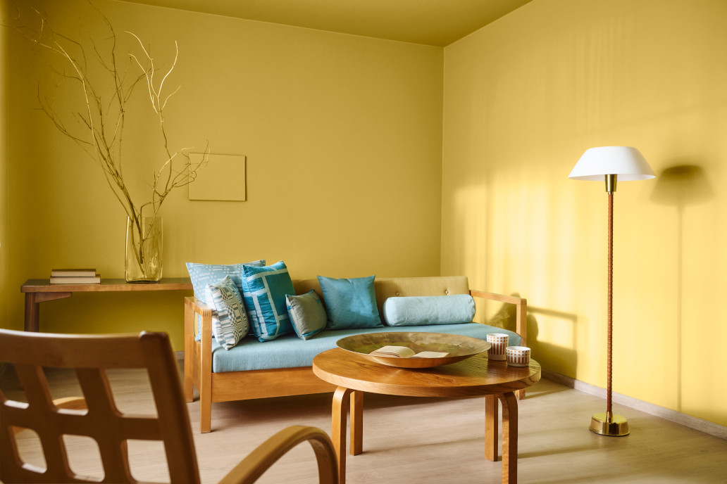
Vibrant Oranges
Grounded
Georgian Leather
Citrus tones might seem like a staple of modern interiors, but intense oranges have long been used to create captivating colour schemes. If you want to bring heat and energy to an interior, anchor your vintage colour scheme to a vibrant orange.
A ginger brown like Grounded is a good alternative to traditional citrus shades. A golden quality makes it a luxurious choice for Art Deco-inspired schemes, while peachy undertones make it incredibly versatile. As such, you’ll have no trouble weaving it into pretty much any vintage palette you have in mind.
For a more conventional orange, try a shade like Georgian Leather. Packed with pumpkin spice character, this brownish orange will provide a grounded base for a more refined interior. Balance things out with a warm off-white and fill your space with furniture crafted from premium dark woods.